Design comparison
SolutionDesign
Solution retrospective
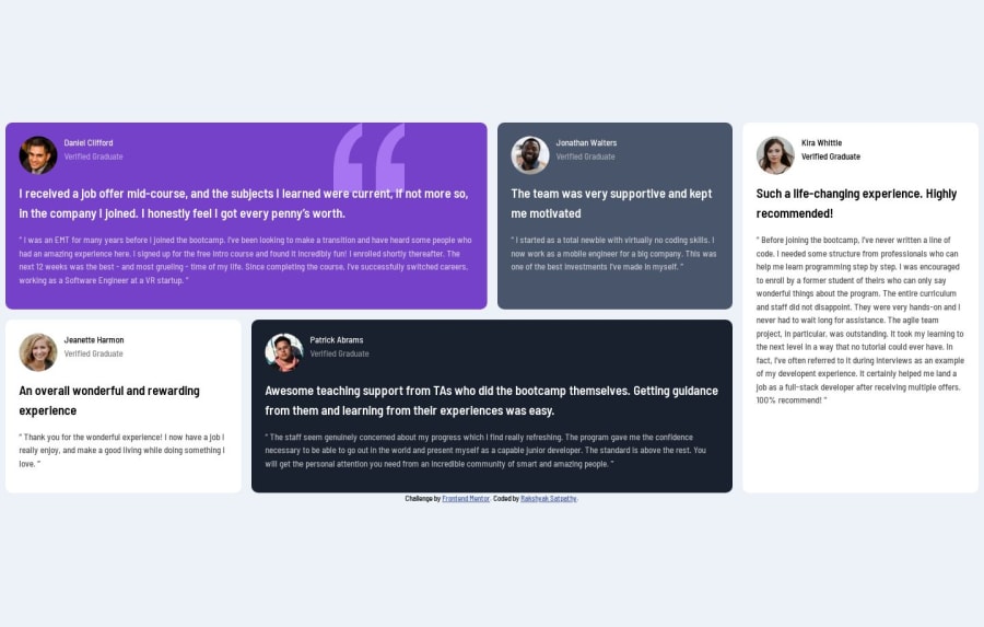
Not much difficulty was faced with this challenge, it was easy with the grid property. However, for the name and profile picture, I applied the flow property, which resulted in a more accessible layout. I do not take care of the tab view. it's important to note that excessive nesting of divs or unnecessary nested elements can complicate the extraction of elements by search bots, making data extraction more challenging to handle. For that we can minimize nesting as much as possible.
Community feedback
Please log in to post a comment
Log in with GitHubJoin our Discord community
Join thousands of Frontend Mentor community members taking the challenges, sharing resources, helping each other, and chatting about all things front-end!
Join our Discord
