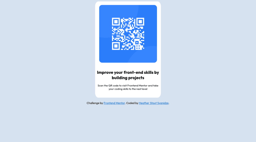
Design comparison
SolutionDesign
Community feedback
- @igafshellPosted about 2 years ago
Hey Heather!
Congratulations on completing your first challenge on Frontend Mentor! 🎉🎉
I would suggest that you add a few details to your code:
- You can leave the attribution, but make sure to respect the HTML5 semantics and use the
<footer>tag instead of<div>. If you want, you can make it stick to the bottom by putting the following css:body {display: grid; grid-template-rows: auto 1fr; place-items: center}. This will make the card push the footer to the bottom and occupy the rest of the space, and also center horizontally and vertically the elements. - Set
max-width: 20remto card body to match the size of the design and also make sure to use rem instead of px. And setwidth: 100%;to the.imgto make it fit the card. - Add a
box-shadowattribute to the card. You can read more about this attribute in this article. - Add an empty
<h1>to resolve the accessibility issue. Although this is just a component, you still need to put it in.
Well, that's about it. Happy coding!
Marked as helpful0 - You can leave the attribution, but make sure to respect the HTML5 semantics and use the
Please log in to post a comment
Log in with GitHubJoin our Discord community
Join thousands of Frontend Mentor community members taking the challenges, sharing resources, helping each other, and chatting about all things front-end!
Join our Discord
