Not Found
Not Found
Not Found
Not Found
Not Found
Not Found
Not Found
Not Found
Not Found
Not Found
Not Found
Not Found
Not Found
Not Found
Not Found
Not Found
Not Found
Not Found
Not Found
Not Found

Submitted

HTML, CSS

Olabayoji 135

@Olabayoji

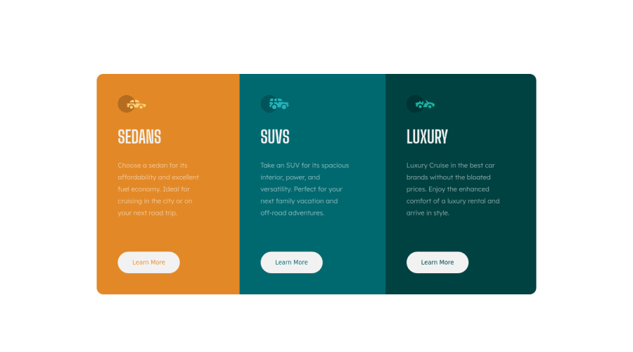
Desktop design screenshot for the 3-column preview card component coding challenge

This is a solution for...

  • HTML
  • CSS
1newbie
View challenge

Design comparison


SolutionDesign

Solution retrospective


Any feedback would be highly welcome. Also is it okay that I do not want to use bootstrap and other frameworks necessary in some cases because I want to sharpen my CSS? Thank you

Community feedback

Tarik 60

@tikeyike

Posted

Just some stylistic feedback:

  1. If you're adding a border to the hovered button, you should also include a border on the default button - this will get rid of the change in the button height (just hover over your buttons, and you will see the button "grow" by 2px).

  2. You can also add in a transition to make the buttons "feel" a bit nicer when you hover over them.

button { /* border: none; */ border: 2px solid transparent; }

[class*="btn-"]:hover { /* border: 1px solid white; */ border: 2px solid hsl(0, 0%, 100%); transition: 0.2s ease-in; }

Marked as helpful

0

Olabayoji 135

@Olabayoji

Posted

@tikeyike thank you so much. Was wondering what to do to solve the button height problem. I’d implement it right away.

0
Carlos 1,110

@Carlos-A-P

Posted

This looks great! And yes, it's completely fine not wanting to use any frameworks for now. I've been completing my challenges using only CSS, HTML, and Javascript to improve those skills until I feel comfortable enough to move on. Keep up the good work!

Marked as helpful

0
Olabayoji 135

@Olabayoji

Posted

Thank you so much. You’ve been helpful.

0

@pikapikamart

Posted

Hey, great work on this one. Layout seems good both desktop and mobile and it is responsive as well.

You already had some great feedbacks, just going to add some:

  • Avoid using multiple h1 element in a single webpage only use 1 h1. Those car names could have used h2 and for the h1 element, it could be screen reader only text, it will have sr-only class. You can search for this class, it is just css stylings that is intended for screen reader users.
  • the learn more I think is more great inside a a tag element, since it is like a link that will take the user to " learn more" about the car that they selected right.
  • Lastly, a padding to the bottom of the body tag, just to prevent the content from touching the flooring(bottom part of the screen);

Aside from those, great work.

0

Olabayoji 135

@Olabayoji

Posted

@pikamart that was helpful. I still don’t understand the sr-only class.

0

@pikapikamart

Posted

@Olabayoji Hey, glad that it was helpful.

When you encounter people saying sr-only class, it is a class styling which is intended for people who uses screen readers. Because there are people for example, people who are blind and for them to use the website properly, they use screen readers.

A sr-only class, or you can call this any name, but typically, people address it by that name. A css stylings that makes an element hidden to a person who can see properly, but makes the element appear for people who can't see.

.sr-only {
  border: 0;
  clip: rect(0 0 0 0);
  height: 1px;
  margin: -1px;
  overflow: hidden;
  padding: 0;
  position: absolute;
  width: 1px;
}

That is my styling for a sr-only element. You apply that classname to an element which you intended for people with disabilities to only see.

Marked as helpful

0
Olabayoji 135

@Olabayoji

Posted

@pikamart oh. That makes sense. So in the column preview challenge, in what instance do I use the sr/only class? I’m guessing I could apply it to the car icons since visually impaired people won’t be able to see it.

0

@pikapikamart

Posted

@Olabayoji No no, you might have notice when using img element, there is the alt attribute right. Now, that alt attribute is what screen readers say to the user when they encounter that img, so you don't need to add a sr-only for them.

On your case, the best possible use case of this is when the user navigates in the main element. As you can see, main element is a landmark, this landmarks helps screen reader users to navigate properly. When a user navigates through this, a screen reader would read the very first text that it could find, making that text the like overall headline.

On this one, what we could do is that, when the user navigates in your website, navigated on your main since the person doesn't know what he/she would be informed with, we are going to supply them the text, we will use h1 element with a text for example:

 <h1 class="sr-only">
  frontendmentor car variety information
</h1>

Now even if they can't see what our website is all about, that text will give them an overview to what our website's content is all about.

Marked as helpful

0

Please log in to post a comment

Log in with GitHub
Discord logo

Join our Discord community

Join thousands of Frontend Mentor community members taking the challenges, sharing resources, helping each other, and chatting about all things front-end!

Join our Discord