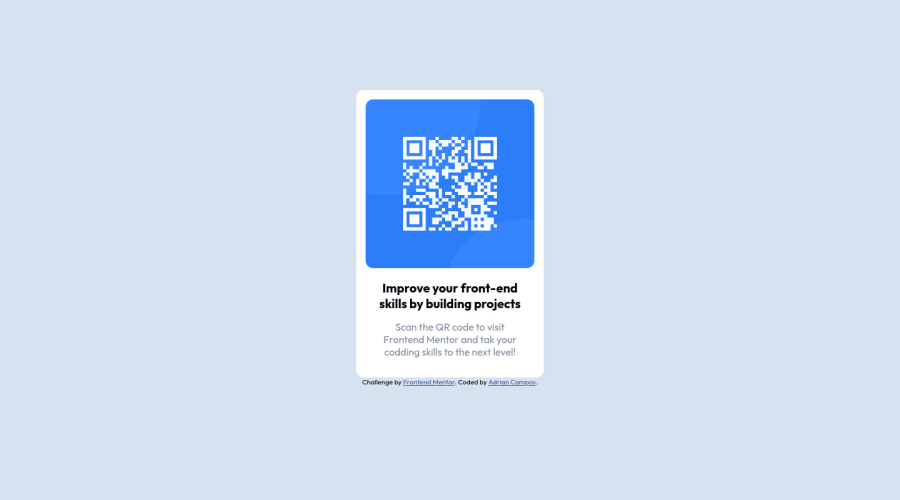
Design comparison
Solution retrospective
What kind of tools do you use to take spaces and colors from a image to convert to a html and css?
Let me know how I could improve
Community feedback
- Account deleted
Good work! Some suggestions if you don't mind:
- Use semantic tags, avoid div's. The 'card' class can be a <main> tag.
- You're missing an h1. Class 'title' change it to an h1 I think that this will correct the errors in your report. 😉
Marked as helpful1@jadriancPosted over 2 years ago@irismendez Thanks for your advice, I saw your solution and now I know what you mean, by the way, what tool do you use to create gifs?
0Account deleted@jadrianc Hi Adrian, first I record the screen with OBS, it saves as mp4, then I convert it to gif with [https://image.online-convert.com/convert/mp4-to-gif]
If you google you will find more, I use that 😉
Marked as helpful0 - @correlucasPosted over 2 years ago
Hello Adrian, welcome to Frontend Mentor Community and congratulations foe your first challenge!
Answering your question:
The tools you can use to measure the spaces, width, fonts and sample colors can be any image-editor as Photoshop, Gimp, Affinity Photo or a prototype software as Figma/Adobe XD/Sketch, you can an idea of spacing, fonts and colors measuring this values comparing to the design files. But its very limited and will be hard for more complex projects.
The best option, in my opinion, for sure is having the PREMIUM SUBSCRIPTION because having access to the Figma files you can have the exact values for padding, spacing and etc. Saving a lots of time just coding instead of trying to guess stuff like the font-size or container width! It's my personal opinion but it think worth the buck.
You can also use the starter files to have the font-size and the color palette info.
I hope it helps you, keep coding and feel free to ask me further questions! ✌️
Marked as helpful0 - @Derrick-ndemoPosted over 2 years ago
Hello there Adrian. I as a Newbie used CSS flexbox to position the middle container. for the text, I personally used the text-align property (center)
Marked as helpful0
Please log in to post a comment
Log in with GitHubJoin our Discord community
Join thousands of Frontend Mentor community members taking the challenges, sharing resources, helping each other, and chatting about all things front-end!
Join our Discord