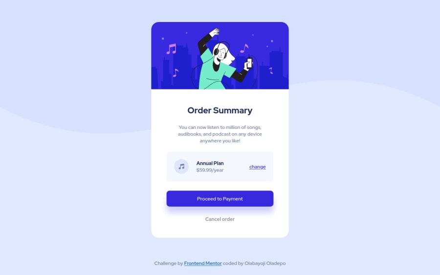


Design comparison

Solution retrospective
Is there anything I could have done better? Constructive criticism is welcome. Thank you.
Community feedback
- @MoodyJWPosted about 3 years ago
Nice job! I have a couple of suggestions that might help.
Mobile styles are off on some of the larger mobile screens. I'm pretty sure I made the same mistake on this at first, but you're media query
@media screen and (max-width: 375px)is smaller than it needs to be. For example, a Pixel 2 has a width of411pxand the card is on the edges of the screen.Your html is missing a few things that are needed for accessibility. You should wrap content in a
<main>element. I'd suggest changing this div:<div class="card">to be<main class="card>. Also, your footer can be wrapped in<footer>. These changes will make it easier for people using screen readers.Hope this helps!
0@OlabayojiPosted about 3 years ago@MoodyJW Thank you so much. I’ll effect the changes as soon as possible. And I sincerely appreciate the suggestions. 🤝🤝
1

Please log in to post a comment
Log in with GitHub
Join our Discord community
Join thousands of Frontend Mentor community members taking the challenges, sharing resources, helping each other, and chatting about all things front-end!
Join our Discord