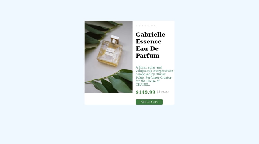
Design comparison
SolutionDesign
Community feedback
- @sinjin25Posted over 2 years ago
Good attempt :)
If you look at the design doc for mobile, you can see that the image is actually cropped on mobile sizes. You can do this for mobile by setting a height on the img and using object-fit:
object-fit: cover;
max-height: 200px;
As for the colors and fonts, there is a 'style-guide.md' provided in the files you downloaded if you want to get the fonts and colors as they were in the design doc. You're also free to explore alternative styles as well
Marked as helpful0@ahmedmiliPosted over 2 years ago@sinjin25 thanks for your advice i will fix it as soon as possible :)
1
Please log in to post a comment
Log in with GitHubJoin our Discord community
Join thousands of Frontend Mentor community members taking the challenges, sharing resources, helping each other, and chatting about all things front-end!
Join our Discord
