Design comparison
SolutionDesign
Solution retrospective
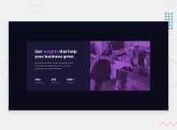
When Im trying to move to phone mode in my laptop the picture looks weird , any idea ?
Community feedback
- @Kirin02Posted about 3 years ago
Hello, You did a mistake in the border-top-left-radius i believe you wanted to target border-bottom-right-radius !
Marked as helpful0 - @Gabrielbe17Posted about 3 years ago
Hi medo, I see your background image looks squished:
- I'll suggest you to change the value of the min-width property of your media query to 1000px.
- Also I suggest you to design the component for a mobile viewport size so that it can be easier to resize the things, but its up to you.
Marked as helpful0
Please log in to post a comment
Log in with GitHubJoin our Discord community
Join thousands of Frontend Mentor community members taking the challenges, sharing resources, helping each other, and chatting about all things front-end!
Join our Discord

