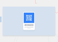
Design comparison
Community feedback
- @aboAbassAlshaegePosted almost 3 years ago
Welcome ! . The Html is good , But you need to edit the CSS.
1 - Set an Appropriate width to the main box . 2 - You should centerlize your main box with ( transform ) , And ( position : absolute ) like the following : position : absolute; top : 50%; left 50%; transform : translate( -50% , -50% ) . 3 - You can centerlize the ( h2 ) and the ( p ) just by adding ( text-align : center ) to the parent ( the main box ). 4 - Just add ( max-width : 100% ) to the ( img ) and remove the other properties
Marked as helpful0@VANIMEHTAPosted almost 3 years ago@aboAbassAlshaege Hi ,I have a doubt I made the changes you suggested and its working fine but i also want to give some margin at bottom and when i do so the qr-image is not fitting in the box. pls help me with this.
0 - @aboAbassAlshaegePosted almost 3 years ago
Hi again . if you centerlize your div card with :
positon: absolute;
top : 50%;
left : 50%;
transform : translate ( -50% , -50% )
you will not need any margin anywhere. and you should add ( width ) to the main box ( 320px ) for example.
0
Please log in to post a comment
Log in with GitHubJoin our Discord community
Join thousands of Frontend Mentor community members taking the challenges, sharing resources, helping each other, and chatting about all things front-end!
Join our Discord

