Solution retrospective
What are you most proud of, and what would you do differently next time?
This is pretty straight-forward. Great for beginners, project.
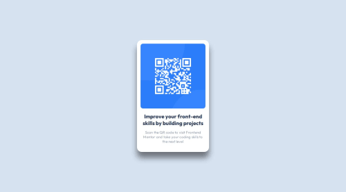
What challenges did you encounter, and how did you overcome them?The size of the qr code and colors were a little bit of a challenge. Before realizing that I could use Figma to solve the issue.
What specific areas of your project would you like help with?None
Code
Loading...
Please log in to post a comment
Log in with GitHubCommunity feedback
No feedback yet. Be the first to give feedback on Markus Harrison's solution.
Join our Discord community
Join thousands of Frontend Mentor community members taking the challenges, sharing resources, helping each other, and chatting about all things front-end!
Join our Discord