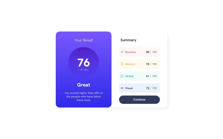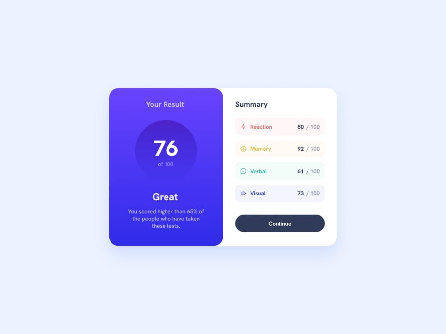
Design comparison
Community feedback
- @0xabdulkhaliqPosted almost 2 years ago
Hello there 👋. Congratulations on successfully completing the challenge! 🎉
- I have other recommendations regarding your code that I believe will be of great interest to you.
HTML 🏷️:
- This solution may cause accessibility errors due to lack of semantic markup, which causes lacking of landmark for a webpage and allows accessibility issues to screen readers, due to accessibility errors our website may not reach its intended audience, face legal consequences, and have poor search engine rankings, highlighting the importance of ensuring accessibility and avoiding errors.
- What is meant by landmark ?, They used to define major sections of your page instead of relying on generic elements like
<div>or<span>. They are use to provide a more precise detail of the structure of our webpage to the browser or screen readers
- For example:
- The
<main>element should include all content directly related to the page's main idea, so there should only be one per page - The
<footer>typically contains information about the author of the section, copyright data or links to related documents.
- So resolve the issue by replacing the
<div class="container">element with the proper semantic element<main>in yourindex.htmlfile to improve accessibility and organization of your page
.
I hope you find this helpful 😄 Above all, the solution you submitted is great !
Happy coding!
Marked as helpful1@nitindev3dPosted almost 2 years ago@0xAbdulKhalid Thanks for the feedback! I will surely work on it..cheers!!
0 - @Saad-HishamPosted almost 2 years ago
Hey there! Great job on your work, it's looking really good✨ I just wanted to give you a few friendly tips that could help make it even better.
Firstly, for better accessibility, you might want to consider wrapping the card in a <main> tag instead of a <div>. This can help improve the structure of your page and make it easier for screen readers to navigate.
Secondly, your styling looks great! I'd suggest adding a cursor pointer on hover and a background color to help users know where they should click. You can achieve this by adding the following code to your element style:
button:hover{ border: none; cursor: pointer; background: rgb(77,34,201); background: linear-gradient(180deg, rgba(77,34,201,1) 56%, rgba(49,44,235,1) 100%); }Overall,keep up the great work🔥 and don't hesitate to reach out if you need any more help or advice!
Marked as helpful1@nitindev3dPosted almost 2 years ago@Saad-Hisham Thanks mate! for the feedback. I would gladly take your advice on improving accessibility and structure part. I was focused mainly on CSS part but ignored the interaction using javascript. I will reach out to you in future for more constructive feedbacks from you... cheers!!
0
Please log in to post a comment
Log in with GitHubJoin our Discord community
Join thousands of Frontend Mentor community members taking the challenges, sharing resources, helping each other, and chatting about all things front-end!
Join our Discord
