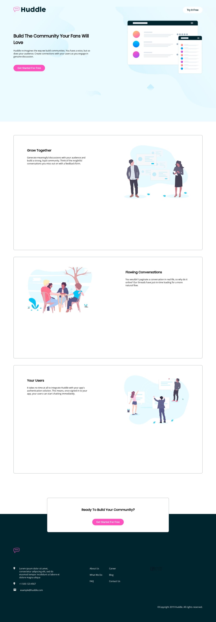
Design comparison
Solution retrospective
Thoughts? I just started coding HTML/CSS and will soon dive into responsive design.
- I use a 2560x1440 monitor and my design looks awkward (e.g., oversized divs). Going forward, what tools can help me anticipate that problem?
2)Is there a way to manipulate div aspect ratios across viewports using CSS?
3)W/r/t top container, is z-index the only way to make the background image go between the background color and the text/images? I was hoping there was a more intuitive way to do so, maybe with opacity?
Community feedback
- @AquelehomemPosted almost 5 years ago
I think what you ll need is a tool to measure the width of the elements in the page (div,img,buttons...), consider not use percentage for width, use pixels , at least dats what works for me. In my solutions i ve been using pixelZoomer or irfanView. I learned some fundamentals from this gal in the video : https://www.youtube.com/watch?v=rNBV_MstSdI
1 - @mattstuddertPosted almost 5 years ago
Nice work on this challenge and congrats on submitting your first solution! For the oversized divs, I would recommend just not setting the
height. You can usepaddingon the inside of the element to create the spacing and let the content within dictate the size of the element. Also, for the background image I would actually use thebackground-imageCSS property instead of animgwith az-index.I hope that helps. Keep up the great work! 🙂
0
Please log in to post a comment
Log in with GitHubJoin our Discord community
Join thousands of Frontend Mentor community members taking the challenges, sharing resources, helping each other, and chatting about all things front-end!
Join our Discord
