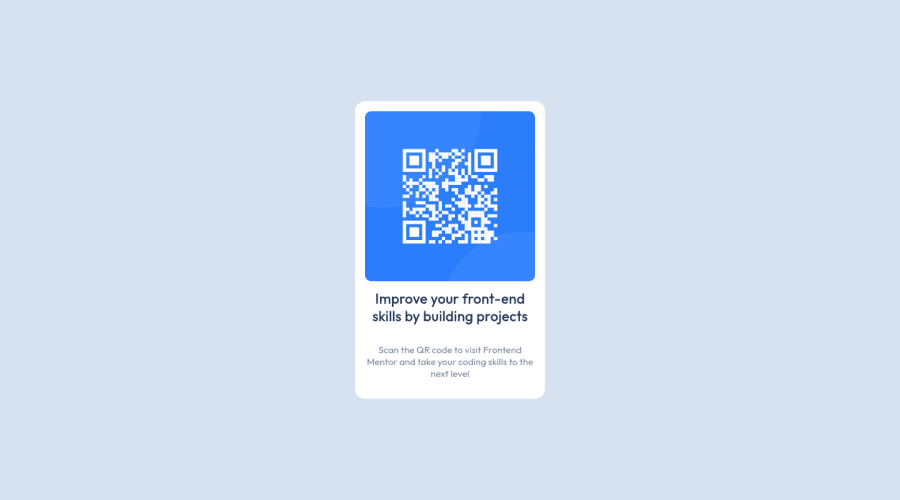
Design comparison
SolutionDesign
Solution retrospective
The div block is confusing, is there someone who can explain it?
Community feedback
- @PhoenixDev22Posted about 2 years ago
Hi Abhishek Singh,
Congratulation on completing your first challenge. Your solution looks great. I have some suggestions regarding your solution if you don’t mind:
- You should use
<main>to wrap the card. HTML5 landmark elements are used to improve navigation experience on your site for users of assistive technology.
- Page should contain
<h1>. In this challenge , as it’s supposed to be a part of a whole page, you may use<h1>withsr-onlyclass hidden visually and present for assistive tech users.
- In my opinion, the alternate text should indicate where the Qr code navigate the user : like
QR code to frontend mentor.
- Add
min-height: 100vhinstead ofheight: 100vhto the body that let the body grows taller if the content outgrows the visible page instead.
Hopefully this feedback helps.
0@Abhishek14424Posted about 2 years ago@PhoenixDev22 Thank You for ur suggestions, I will be updating the solution as u said🤝
0 - You should use
Please log in to post a comment
Log in with GitHubJoin our Discord community
Join thousands of Frontend Mentor community members taking the challenges, sharing resources, helping each other, and chatting about all things front-end!
Join our Discord
