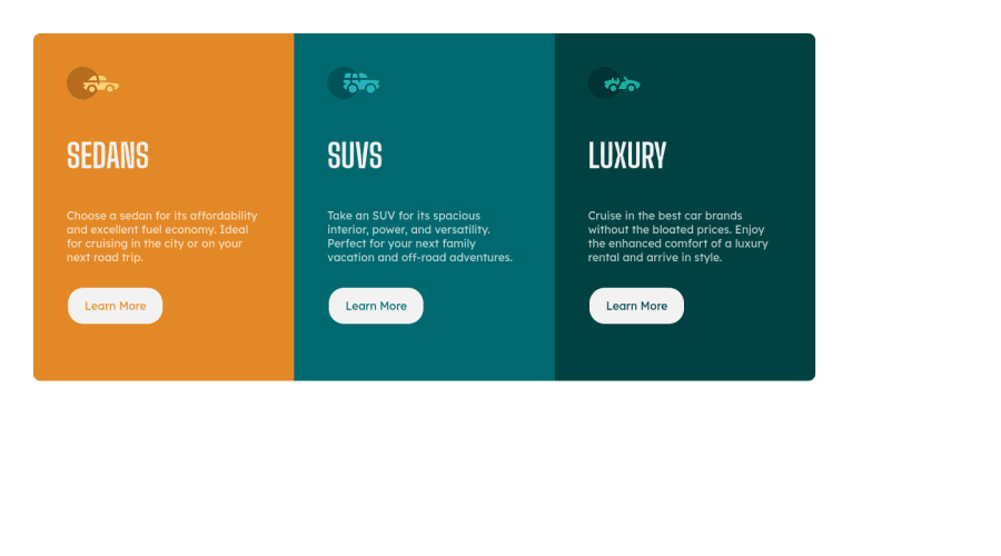
Design comparison
Solution retrospective
- When the page loads, unstyled fonts appear for a split second. Is there a way to fix that?
- I want to know if I implemented the media queries and responsive design correctly (ie as the instructions say)
Any other suggestions and improvements are also welcome!
Community feedback
- Account deleted
Hi,
The browser takes a little bit of time to load the font-family, which is why you see the un-styled fonts.
I don't think the media query should be at 1439px, I mean the screen is still pretty much big and you are switching to mobile, so I highly think it should be changed. And your cards are not centered.
1 - @markup-mitchellPosted over 3 years ago
Hi @henokhm,
I know this is an old solution, but since you've followed me I thought I'd give some feedback!
Flash Of Unstyled Content (FOUC) is something that will probably come up regularly in your career. I've come to the conclusion that it's more of a political problem than a technical one; designers and executives often want to eliminate FOUC for aesthetic reasons, but IME the standard strategies for doing so are often not in the user's best interests.
Here's a (kind of!) recent article you might find useful.
I think the best first step is to choose a fallback system font that's as close as possible to the target, and/or which looks good in its own right. In this case there's not much (on my system at least) that's as narrow as Big Shoulders Display, so there's always going to be a visible shift, but you can change the fallback from
cursivetosans-serifso the FOUC doesn't look quite so web 1.0!It's probably a bit of niche issue, but if you're interested there are lots of "interesting" articles about system fonts to dive into...
0
Please log in to post a comment
Log in with GitHubJoin our Discord community
Join thousands of Frontend Mentor community members taking the challenges, sharing resources, helping each other, and chatting about all things front-end!
Join our Discord
