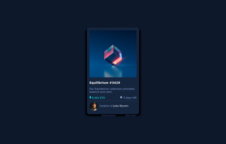
Design comparison
Community feedback
- @VCaramesPosted about 2 years ago
Hey @art5551, some suggestions to improve you code:
-
The hove effect was not applied to your card. Here is a link that will show you how to do it: https://www.w3schools.com/howto/howto_css_image_overlay.asp
-
The NFT Alt Tag description needs to be improved upon. You want to describe what the image is; they need to be readable. Assume you’re describing the image/icon to someone.
-
The Icons serve no other purpose than to be decorative; They add no value. Their Alt Tag should left blank and have an aria-hidden=“true” to hides it from assistive technology.
-
The profile image Alt Tag needs to be improved. It should state the following; “Headshot of -person’s full name-“
-
Wrap the "NFT image", "Equilibrium #3429" and "Jules Wyvern" in an Anchor Tags <a>. The anchor tag will allow users to click on content and have them directed to another part of your site.
Happy Coding! 👻🎃
Marked as helpful0 -
Please log in to post a comment
Log in with GitHubJoin our Discord community
Join thousands of Frontend Mentor community members taking the challenges, sharing resources, helping each other, and chatting about all things front-end!
Join our Discord
