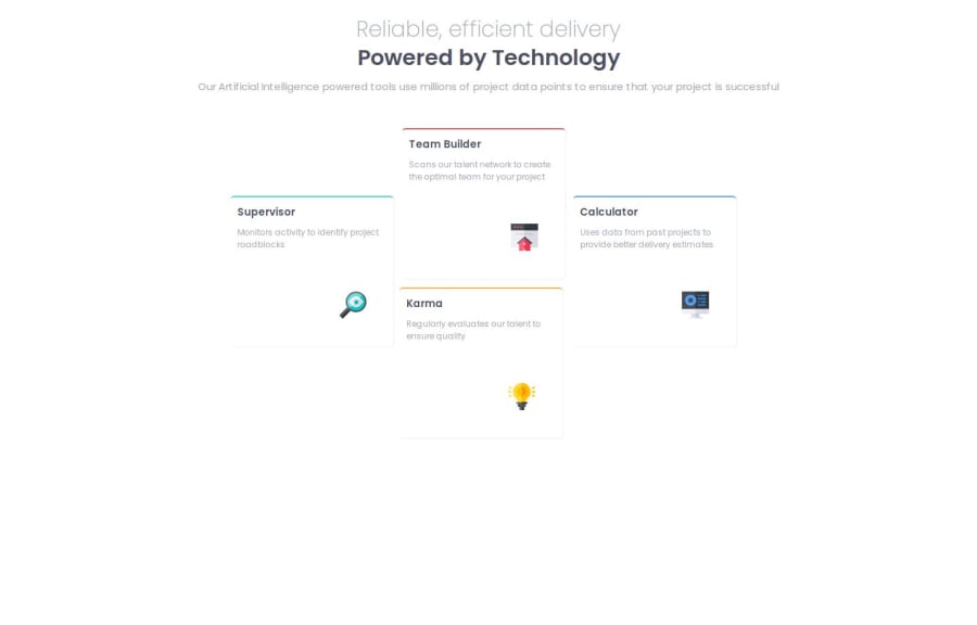
Design comparison
Community feedback
- @alaa-mekibesPosted 3 months ago
Well done 🎉
- Update Your README File
Start by using the provided README template included in the starter file. Customize it to enhance clarity and professionalism.
- Use Only One <h1> Per Page
Maintain a proper heading structure, using <h1>, <h2>, and <h3> in a hierarchical manner. This improves both organization and SEO.
- Never Leave the alt Attribute Blank
Always provide a meaningful alt description for images. This improves accessibility and contributes to better SEO.
- Avoid Using px Unless Necessary
Use relative units like rem or em for sizing instead of px. This ensures better scalability and responsiveness.
More Info:
Rem in CSS: Understanding and Using rem Units
- Use css variables to improved maintainability like this:
:root { --bg-color: hsl(210, 46%, 95%); /* Add your other colors here */ } body { background-color: var(--bg-color); /* Other properties */ }- Center your layout using Flexbox or Grid:
body {
display: grid;
place-items: center;
min-height: 100vh;
}
body { display: flex; justify-content : center; align-items : center; min-height: 100vh; }Brilliant work, stay confident and keep moving forward!
0
Please log in to post a comment
Log in with GitHubJoin our Discord community
Join thousands of Frontend Mentor community members taking the challenges, sharing resources, helping each other, and chatting about all things front-end!
Join our Discord
