

Design comparison

Community feedback
- @grace-snowPosted over 1 year ago
I'm afraid there are some problems with this that need fixing. The html needs some important changes and when I preview this does not fit on my phone.
Starting with HTML:
- All content should be contained within landmarks. Every page minimally needs a
mainelement - don't wrap everything in extra divs for no reason. That img doesn't need a div around it for example
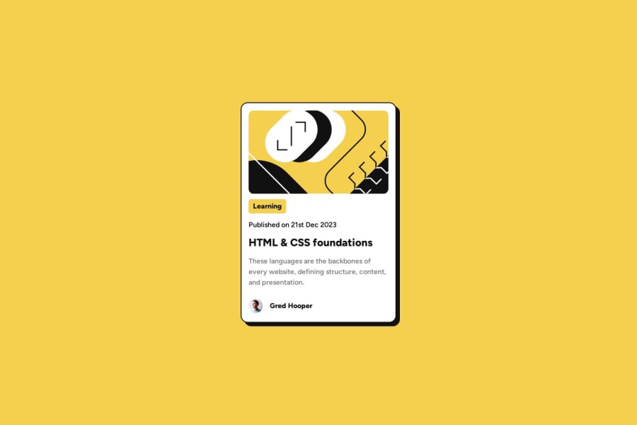
- using heading elements appropriately and only in the correct order is really important. The "learning" category is not a heading, it's just a paragraph. Same with the publish date and author name. You can only have one h1 per page. As this is just a card component that would sit on a page with others, it wouldn't have any h1 at all. The card heading is more likely to be a h2, and that is the only heading in this component.
- if the author image is important content (and I think it is, then it must have a proper description. The alt should allow me to picture what the image looks like without seeing it, but "author" tells me nothing.
- publish date could go inside a time element as well, that's worth reading about
Marked as helpful0@grace-snowPosted over 1 year agoThe CSS problems are common but some are critically important to fix
- Always use a modern css reset at the start of the styles. Look them up
- Do not throw loads of styles on a wildcard selector (*). That is terrible for performance. Resetting margin and padding is fine if you want but don't use it for much
- NEVER ever ever ever write font size in px! More info. Line height and letter spacing must also not be in px.
- The body should never have it's height limited, just as no text containing elements should have their height limited. Instead of height 100vh on the body, use min-height
- Don't set width on the component. This is why it's overflowing my screen. Instead use max-width only in the component and use rem not px so the max width stays proportional to the users font size and gives a properly responsive result.
- You need to understand the difference between padding and margin. This may help
Marked as helpful0@RanitManikPosted over 1 year ago@grace-snow Thank you very much for your kind help. I have reviewed the issues you mentioned and rewritten the code accordingly. I would also like to mention that your blogs were very helpful in understanding the problems in detail and finding the efficient and practical solutions. I am looking forward to your review for my next Frontend Mentor challenges.
0@grace-snowPosted over 1 year ago@RanitManik I can still see a font size in px in the css and you have one written in em. As em units compound you will never want to use them for font size. Em units are only used for properties that you intentionally want to set proportionally to the font size - such as margin top on headings and paragraphs in an article, or padding on a button
Marked as helpful0@RanitManikPosted about 1 year ago@grace-snow I would like to express my sincere gratitude for bringing my mistake to my attention. I have taken the necessary steps to identify and rectify the issue by making the appropriate modifications to the code.
0 - All content should be contained within landmarks. Every page minimally needs a

Please log in to post a comment
Log in with GitHubJoin our Discord community
Join thousands of Frontend Mentor community members taking the challenges, sharing resources, helping each other, and chatting about all things front-end!
Join our Discord