


@sofiasmnk
Posted
You probably don't want to be manually setting a height and width in pixels for every element (.container, img, .content). For an instance, the image could've just had it's width set to 100% and it would've adjusted to the size of the container.
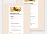
The container appears off-centered to me. I think the margin-left:35%; margin-right: 35%; properties on it are the problem. If you want the margins to adapt so that the content is always centered, you can apply margin: auto. (in this case, where you have 128px set for the margin top and bottom, you could use the margin shorthand to write is all as margin: 128px auto. The first value will be applied to the top and bottom, the second value will be applied to the left and right.)
The challenged proposed that you try to use semantic HTML. The ul and ol elements for the lists have been applied correctly. There are other places where you could've used semantic elements instead of div:
h1,h2,h3etc. for headings;pfor paragraphs;tablefor the nutrition table.
Semantic HTML is better for accessibility and for search engine optimization.
Finally, the design doesn't seem to be responsive. There are a few things you could do to make it responsive:
- Set
max-widthrather thanwidthon elements, allowing them to size themselves down in smaller screens. - Use
margin: auto. - Change styles depending on screen size using media queries (ie.
@media screen and (min-width: 375px)etc.)
For this challenge, there's a different design provided for small/mobile screens, which has some differences from the desktop design. You'd probably have to use media queries to achieve that. However, just using more flexible properties and values like max-width and margin: auto should also help a lot to make things more responsive in general.
