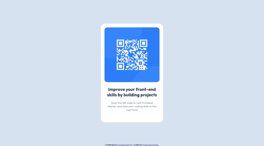
Design comparison
SolutionDesign
Solution retrospective
my initial idea was to make different versions for mobile and desktop, but I abandoned that planning due to lack of idea. I'm accepting suggestions...
Community feedback
- @0xabdulkhaliqPosted over 1 year ago
Hello there π. Congratulations on successfully completing the challenge! π
- I have other recommendations regarding your code that I believe will be of great interest to you.
HTML π·οΈ:
- This solution generates accessibility error reports, "All page content should be contained by landmarks" is due to
non-semantic
markup, which lack landmark for a webpage
- So fix it by replacing the
<div class="align">
element with the semantic element<main>
along with<div class="attribution">
into a<footer>
element in yourindex.html
file to improve accessibility and organization of your page.
- What is meant by landmark ?, They used to define major sections of your page instead of relying on generic elements like
<div>
or<span>
- They convey the structure of your page. For example, the
<main>
element should include all content directly related to the page's main idea, so there should only be one per page
CSS π¨:
- let me explain, How you can easily center the component.
- We don't need to use
margin
andpadding
to center the component both horizontally & vertically. Because usingmargin
orpadding
will not dynamical centers our component at all states
- To properly center the component in the page, you should use
Flexbox
orGrid
layout. You can read more about centering in CSS here π.
- For this demonstration we use css
Grid
to center the component
.align { min-height: 100vh; display: grid; place-items: center; margin: 0; }
- Now remove these styles, after removing you can able to see the changes
.container { position: absolute; margin: 0 auto; }
.
I hope you find this helpful π Above all, the solution you submitted is great !
Happy coding!
Marked as helpful1 - @0xabdulPosted over 1 year ago
Hello Developer well congratulations on successfully completed the QR code component
- A Few Feedback for improve your code
- In Html π :
- LANDMARK π
- The main landmark should be a top-level landmark. When a page contains nested document and/or application roles (e.g. typically through the use of iframe and frame elements), each document or application role may have one main landmark. If a page includes more than one main landmark, each should have a unique label.
- To Clear the Accessibility reports use the Semantic elements Or non - Semantic elements
- Note This Elements are don't sikp
- semantic elements :
<aside> , <artical> , <main>, <header> ,<section><footer>, <form> ect..
- non- semantic elements :
<div> , <span> ect ...
- for easy way to clear the Accessibility reports using non semantic elements Ex :
<body> <div class="container" role="main"> /html code goes here : π </div> </body>
- Or
- using semantic elements
- Ex :
<header> should be put heading or logoπΈ </header> <nav> //Links here </nav> <main> Main of the contents π </main> <footer> Β©copy right hereπ </footer>
- I Hope you find the solution and it's useful for you and your project is great Happy Coding Developer
Marked as helpful1 - @ecemgoPosted over 1 year ago
Some recommendations regarding your code that could be of interest to you.
- In order to fix the accessibility issues, you need to replace
<div class="align">
with the<main>
tag,<div class="attribution">
with the<footer>
tag. :) - You'd better use Semantic HTML, and you can also reach more information about it from Semantic HTML and Using Semantic HTML Tags Correctly.
Hope I am helpful. :)
Marked as helpful0 - In order to fix the accessibility issues, you need to replace
Please log in to post a comment
Log in with GitHubJoin our Discord community
Join thousands of Frontend Mentor community members taking the challenges, sharing resources, helping each other, and chatting about all things front-end!
Join our Discord