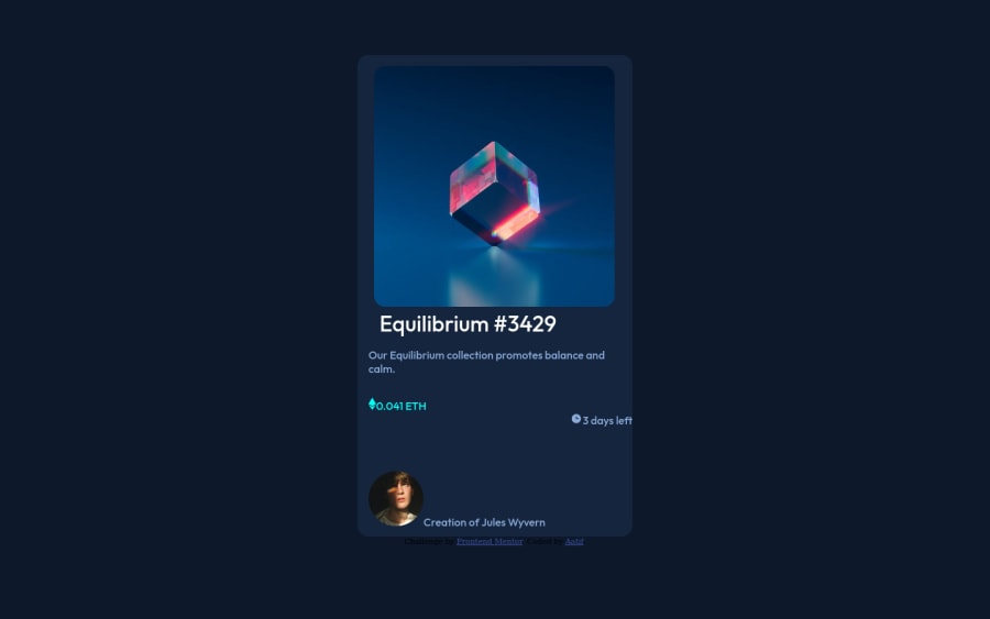
Design comparison
Solution retrospective
was not sure how to get the last two content on the same line
also the dimensions were messed up.
Community feedback
- @PhoenixDev22Posted about 2 years ago
Hi Aatif,
Congratulation on finishing this challenge.
Great job on this one! I have few suggestions regarding your solution:
HTML
- The most important part in this challenge interactive elements. Since there's a :hover state on the image and means it's interactive, So there should be an interactive element around it. When you create a component that could be interacted with a user , always remember to include interactive elements like(button, textarea,input, ..) for this imagine what would happen when you click on the image, there are two possible ways:
1: If clicking the image would show a popup where the user can see the full NFT, here you use
<button>.2:If clicking the image would navigate the user to another page to see the NFT, here you can use
<a>.- The link wrapping the equilibrium image should either have
Sr-onlytext, anaria-labeloralttext that says where that link takes you.
You should have used
<a>to wrapEquilibrium #3429andJules Wyverntoo.- For any decorative images, each img tag should have empty
alt=""and addaria-hidden="true"attributes to make all web assistive technologies such as screen reader ignore those images inicon-clock, icon-ethereum.
- Profile images like that avatar are valuable content. The alternate text should not be avatar.You can use the creator's name
Jules Wyvern. Read more how to write an alt text .
- look up a bit more about how and when to write alt text on images. Learn the differences with decorative/meaningless images vs important content
There are so many ways to do the hover effect on the image, The one I would use is pseudo elements
::before, ::after. You can use pseudo-elements to change the teal background color to hsla. Then the opacity can be changed from 0 to 1 on the pseudo element on the hover. Also using pseudo elements makes your HTML more cleaner as there's no need for extra clutter in the HTML.
- Please Indent your code consistently. It makes it really hard to read and find bugs like this. Your code editor can even do this formatting automatically for you.
- Remember a modern css reset on every project that make all browsers display elements the same.
- Really important to keep css specificity as low/flat as possible. It’s not recommended to use the ids to target the DOM elements for styling purposes, better to use classes so that it could be more manageable and reusable. IDs have a much higher specificity than classes) IDs have many uses in a webpage aside from being a CSS selector. For example as page anchors, fragment identifiers or to link labels to form fields.
- Consider including a git ignore. Less important in this challenge but will become extremely important as you move onto larger projects with build steps.
Hopefully this feedback helps.
Marked as helpful0@AatifxShaikhPosted about 2 years ago@PhoenixDev22 Thank you for the detailed explanation. Really appreciate it. Will consider all your tips. I have a lot more to learn and will try to keep getting better.
1
Please log in to post a comment
Log in with GitHubJoin our Discord community
Join thousands of Frontend Mentor community members taking the challenges, sharing resources, helping each other, and chatting about all things front-end!
Join our Discord
