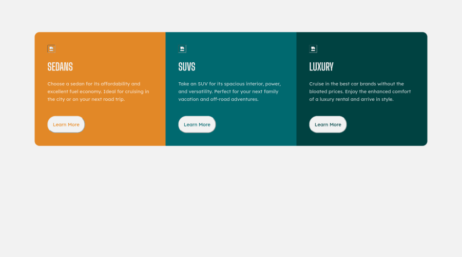
Design comparison
Solution retrospective
Hello Everyone!
I was able to complete the second challenge on HTML and CSS.
Your reviews will be much appreciated.
Gracias!!
Community feedback
- @bulumkopapuPosted over 3 years ago
I love the responsiveness of your code.
I would look into using the max width property on your cards to make them have the same dimensions as the cards on the design. Also I would add "border: none;" to your button class to make sure it looks like the one on your design.
Great effort!
0 - @grace-snowPosted over 3 years ago
Hi
See if you can get this closer to the design if possible.
Make sure you fix the errors in your report and fix the image paths as they are currently pointing to local locations on your computer instead of relative paths to where the images are located in the repository.
Other tips
- include a basic css reset at the start of your css to remove browser default styles
- Don't use large margins like 100px to create a layout. A little padding is all you need on body to stop content hitting the sides, and max-width on the container.
- consider making body min-height 100vh and using flex or grid on that to center your component on the page
- The button elements you've used should be anchor tags as they are for navigation
- Don't use inline styles! Style in css using class selectors. You might want to use mix-blend-mode screen for all the button text instead of defining different colors for each one
- Font sizes always rem (or em) never ever px
- You can put overflow hidden on the container and apply border-radius there instead of defining corners at different breakpoints, if you want
I hope that helps for now.
Definitely keep going with this before moving on to your next challenge as that will really help you :)
- You need to add hover states to the buttons (links) and focus-visible styles
0@bolanleolaPosted over 3 years ago@grace-snow kindly find the URL to the second attempt: https://bolanleola.github.io/3-column-preview/
0 - @princemuelPosted over 3 years ago
Hello Dipo, pls avoid using tables and floats in your CSS except for extreme cases. modern CSS layouts use grid and flexbox.
Also,
* {box-sizing: border-box}
sets all elements to have a box-sizing of border-box so there's no need to set it again.If you have to declare the same styles e.g 40px; again, use CSS variables.
The order of your CSS should be:
- Browser Default Styles Reset e.g box-sizing, padding, margins. You can use this to avoid the hassle
- Basic Page Setup e.g body, container, headings, links, images etc.
- Components' styles
Also, do some research on the structure, accessibility and semantics of html.
what code editor do you use?
0@bolanleolaPosted over 3 years ago@pHoeniX-svg thank you for the feedback. I used VS code editor
0
Please log in to post a comment
Log in with GitHubJoin our Discord community
Join thousands of Frontend Mentor community members taking the challenges, sharing resources, helping each other, and chatting about all things front-end!
Join our Discord