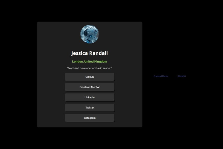


Design comparison

Solution retrospective
I’m most proud of achieving a clean and responsive design for the profile card using rem units for consistent sizing and flexbox for layout alignment. The CSS transitions for hover and focus states also enhance the user experience, making the interface feel interactive and polished.
Next Time: Next time, I would consider incorporating CSS Grid for more complex layouts and experimenting with advanced CSS animations to add more visual interest. I’d also like to ensure even better accessibility and test the design on a wider range of devices and screen sizes to improve overall usability.
What challenges did you encounter, and how did you overcome them?One challenge was converting pixel values to rem units to ensure responsive and scalable design across different devices. Initially, it was tricky to maintain visual consistency while switching units.
Solution: To overcome this, I carefully calculated the rem values based on the default root font size and tested the design extensively in different browser environments. I also used CSS variables for consistent color management and made adjustments based on real-world testing to fine-tune the layout.
What specific areas of your project would you like help with?I would appreciate feedback on the following areas:
Responsiveness: Are there any improvements I could make to better handle different screen sizes, especially for mobile devices? Accessibility: What additional steps can I take to enhance accessibility for users with disabilities? CSS Techniques: Are there more efficient or modern CSS techniques that could improve the layout or performance of the profile card?
Community feedback
Please log in to post a comment
Log in with GitHub
Join our Discord community
Join thousands of Frontend Mentor community members taking the challenges, sharing resources, helping each other, and chatting about all things front-end!
Join our Discord