


Melvin Aguilar 🧑🏻💻• 61,240
@MelvinAguilar
Posted
Hello 👋. Congratulation on successfully completing your first challenge 🎉 ! !
I have some recommendations regarding your code that I believe will be of great interest to you.
HTML 🏷️:
- Use semantic elements such as
<main>and<footer>to improve accessibility and organization of your page.
- Instead of splitting the paragraph into three different elements, you should use a single
<p>element and use some CSS properties likemax-widthto give it the proper shape. Currently, screen readers will read each <p> element, which will make it difficult to understand a simple paragraph.
Font 🔤:
-
It's recommended that you always use the font provided by the challenge's style guide.To import a font, follow the steps below:
- Go to the font's page on Google Fonts: https://fonts.google.com/specimen/Outfit.
- A sidebar will appear with a code snippet that you can use to import the font.
- Copy this code snippet and paste it into the <head> section of your HTML document.
- Now you can use the "Outfit" font in your CSS by specifying
font-family: 'Outfit', sans-serif;.
CSS 🎨:
- Instead of using pixels in font-size, use relative units like
emorrem. The font-size in absolute units like pixels does not scale with the user's browser settings. Resource 📘.
- Avoid using
position: absoluteto center an element as it may result in overflow on some screen sizes. Instead, utilize the flexbox or grid layout for centering. Get more insights on centering in CSS here here 📘.
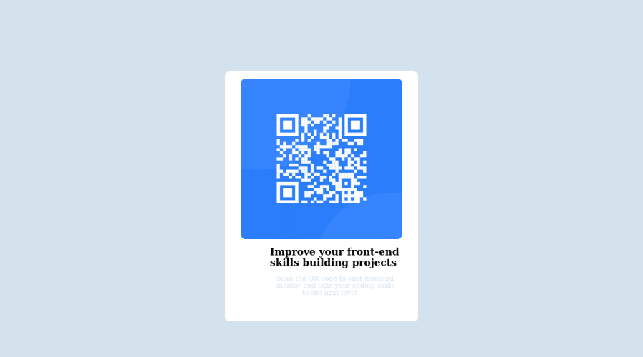
- For a responsive and resizable component, consider using
max-widthfor the width and addingpaddingto avoid border touching the image. Also, setwidth: 100%for the image to fit the size of the component.
- For better readability, consider changing the color of the paragraph element to a darker hue, such as
hsl(220deg, 15%, 55%). This will increase contrast and make the text more legible against the background.
I hope you find it useful! 😄 Above all, the solution you submitted is great!
Happy coding!
2
