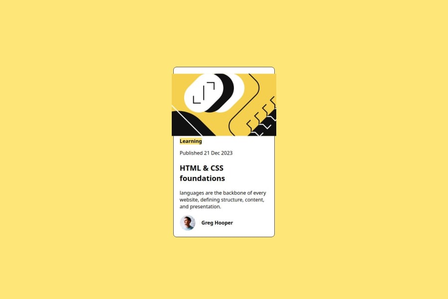
Design comparison
Solution retrospective
I won't say am proud of anything, but am thankful for this rare opportunity to learn and practice.
What challenges did you encounter, and how did you overcome them?Media querry
What specific areas of your project would you like help with?I need an overall critisim to help point out all my flaws, cos i kinda know and not perfect yet
Community feedback
- @Harsh-Kumar-DwivediPosted about 1 year ago
Hi @Valchali ,
I think you can prefer to use
<main>element instead of<div class="container">and<h1>instead of<h2>here<h2>HTML & CSS foundations</h2>.These will improve accessibility.
It will be better if you give
containerclass a specific value in themax-widthproperty and then try to fix the design without using media queries.These should center the card properly.
Try using following code for giving
<h2>color yellow in hover state:-h2:hover { color: hsla(49, 100%, 72%, 0.938); }If you find my suggestions helpful, kindly, please consider marking them as "Marked as helpful".
Stay Happy and Healthy !
Happy Coding ! 😀
Marked as helpful1 - @EkoNdongAyecabaPosted 12 months ago
Hi @Valchali
I noticed that your
<span>Learning</span>need a padding and a margin-top, with that i think everything will be completely OKHave a good day
0@ValchaliPosted 12 months ago@EkoNdongAyecaba please can be specific with the padding and a margin-top parameters that you recommend?? cos ive tried mine and the padding is pushing it up to cover the suppose space. Thank you
0
Please log in to post a comment
Log in with GitHubJoin our Discord community
Join thousands of Frontend Mentor community members taking the challenges, sharing resources, helping each other, and chatting about all things front-end!
Join our Discord
