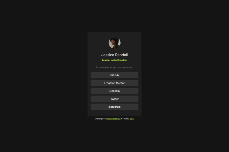
Design comparison
Community feedback
- @cyber-mPosted 6 months ago
Great work! @MdZaferEqbal, Just one small thing padding should be larger on desktop
Marked as helpful0@MdZaferEqbalPosted 6 months ago@cyber-m Thanks for the feedback. I will be updating it soon.
0@cyber-mPosted 6 months ago@MdZaferEqbal Sure, no problem :) I liked the 3D stuff on your website, I don't know if it's intentional but the table UV mapping resulting in stretched texture. I'm experienced 3D technical artist so feel free to ask me anything on the topic.
0
Please log in to post a comment
Log in with GitHubJoin our Discord community
Join thousands of Frontend Mentor community members taking the challenges, sharing resources, helping each other, and chatting about all things front-end!
Join our Discord
