Not Found
Not Found
Not Found
Not Found
Not Found
Not Found
Not Found
Not Found
Not Found
Not Found
Not Found
Not Found
Not Found
Not Found
Not Found
Not Found
Not Found
Not Found
Not Found
Not Found

Submitted

HTML, CSS

P
cloudpc7 180

@cloudpc7

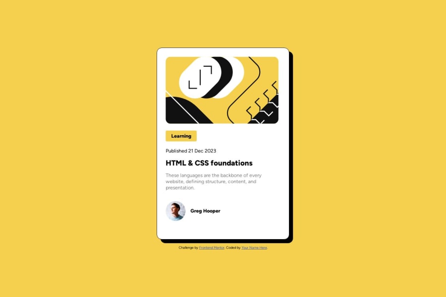
Desktop design screenshot for the Blog preview card coding challenge

This is a solution for...

  • HTML
  • CSS
1newbie
View challenge

Design comparison


SolutionDesign

Solution retrospective


I have completed my first design draft for this challenge. I am unsure of the challenge part where it states users are able to focus states for all interactive elements on page. I didn't make any active states. I probably need to read through the challenge again though. I would like to know what is best practice when making the sizes for these designs. Such as width and height when it comes to the actual card itself. Thank you for all the feedback.

Community feedback

Daniel 🛸 44,230

@danielmrz-dev

Posted

Hello @cloudpc7!

You did a very good job there!

I have just a very simple suggestion for improvement:

  • Since the title is a clickable element, it's nice to add cursor: pointer to it in addition to the color shift when hovered over.

I hope it helps!

Other than that, you did a great job!

0

@Blackpachamame

Posted

It is great! 😁

Regarding your questions about width and height:

  • It is better to use max-width and min-height instead, these will be reduced or extended respectively, if necessary. On the other hand, with width and height they will always maintain the same size. Taking your example code, I made some changes and I think it looks better this way, at least it doesn't look so big:
.container {
    display: flex;
    flex-direction: column;
    background-color: #ffffff;
    max-width: 22.75em;
    min-height: 33.75em;
    border: 1px solid #000000;
    border-radius: 1em;
    box-shadow: 12px 12px #000000;
    padding: 1.75em;
    margin-bottom: 1.25em;
}
  • In your img also do not use width, instead use max-width: 100%, this will make the image fit the container and not overflow
  • In the avatar's img, applying height: 100% doesn't change much. In that case, if you can define a fixed width because the image will always maintain the same size, also add a height: auto so that it maintains its aspect ratio:
.illustrator {
    width: 45px;
    height: auto;
}
  • Instead of adding a margin-right to the img, you can apply the gap property to your author class, this generates the space you need:
.author {
    display: flex;
    align-items: center;
    margin-top: 1em;
    gap: 1em;
}
0

Please log in to post a comment

Log in with GitHub
Discord logo

Join our Discord community

Join thousands of Frontend Mentor community members taking the challenges, sharing resources, helping each other, and chatting about all things front-end!

Join our Discord