Design comparison
Solution retrospective
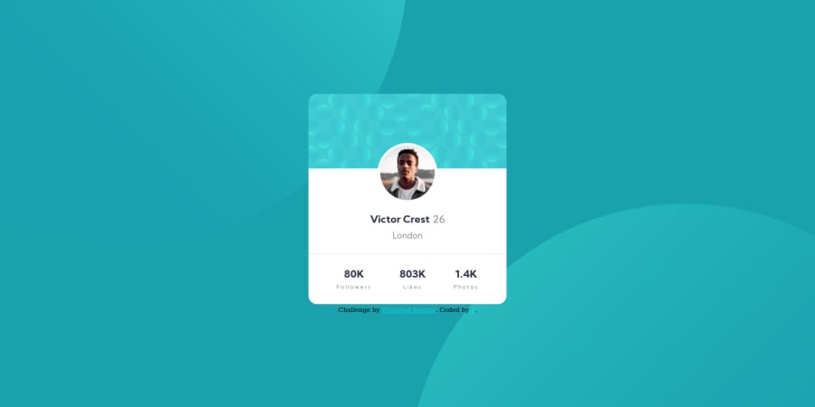
I had some trouble with the design layout especially the position of different sections and divs. At some point where I feel like I overuse position relative and absolute just to move that section. I wish there could be a simpler approach to this in CSS, but I will leave this for now. I think the background circle svg position can also be improved. I am not sure about the responsive design for the fonts. Any suggestions about the layout would be greatly appreciated.
Community feedback
- @SJ-NosratPosted over 3 years ago
Hi Fay, With regards to positioning the background patterns, you can add the following:
background-position: top -47rem left -69rem, bottom -49rem right -69rem;to yourbodytag.You can change the numeric figures to the desired value to position the patterns as you wish.
Also, I noticed that you coded first for the desktop version first. The best workflow is to start Mobile approach and then adding
@media (min-width: *desired values here*)progress to larger screen sizes. This way you simplify the process for coding up your solution.Hope the above helps!
Best of luck with your coding journey!
Marked as helpful0
Please log in to post a comment
Log in with GitHubJoin our Discord community
Join thousands of Frontend Mentor community members taking the challenges, sharing resources, helping each other, and chatting about all things front-end!
Join our Discord
