Design comparison
Solution retrospective
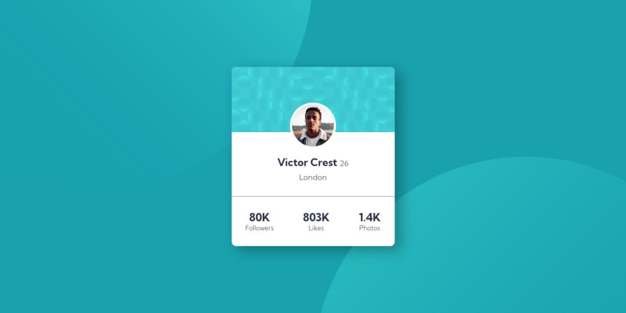
Hello guys im really proud of this one i got stuck only when applying the background images and the position but with some research on the internet i got them right,Well i hope so. Tell me what you think and if you have any feedback, Thank you for the answers and happy coding!
Community feedback
- @correlucasPosted about 2 years ago
👾Hello Moscow, Congratulations on completing this challenge!
One more tip for you:
The card is not responsive yet due
min-widthyou've used this means that the card can grow but not shrink, its not a good a idea because it means that the card will be not flexible to contract an fit better the content, instead usemax-widthto have it flexible:.container { margin: 0 auto; background-color: white; max-width: 375px; max-width: 1440px; border-radius: 10px; overflow: hidden; box-shadow: 13px 10px 31px 0px rgb(0 0 0 / 31%); }✌️ I hope this helps you and happy coding!
Marked as helpful1
Please log in to post a comment
Log in with GitHubJoin our Discord community
Join thousands of Frontend Mentor community members taking the challenges, sharing resources, helping each other, and chatting about all things front-end!
Join our Discord
