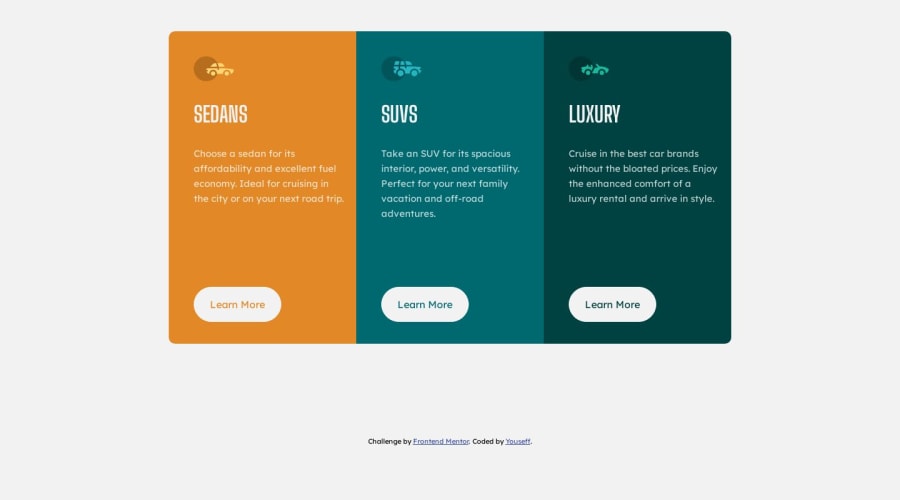
Design comparison
Solution retrospective
It was hard to make it responsive, and it's not good tho , please leave some suggestions for me to improve myself
-
- Thanks ❤
Community feedback
- @mukwende2000Posted over 1 year ago
Responsiveness is kind tricky if you go the desktop first approach, so try to change your approach, design for the mobile first and go to large screen, this is easier because a site is responsive by default without a single line of CSS. Lets go through your some of your code
@media (max-width: 800px) { body { /* height: 700px; */ } }
Avoid heights because they cause unexpected and strange behaviors
main { /* display: flex; align-items: center; */ /* height: 100%; */ /* position: relative; */ outline: 1px solid red; } main .container { display: flex; align-items: center; justify-content: center; /* position: absolute; */ /* top: 50%; left: 50%; */ /* transform: translate(-50%, -50%); -webkit-transform: translate(-50%, -50%); -moz-transform: translate(-50%, -50%); -ms-transform: translate(-50%, -50%); -o-transform: translate(-50%, -50%); height: 100vh; */ }
I see you have a container that is wrapped inside a main tag, but then you gave both the main and the container display flex. you don't need it on the main tag. Also you don't need the position relative and absolute on the main and container respectively, this is the reason you then have the transforms, its because position can be difficult to handle if you don't understand how it works, so removing the position on both tags solves the issue and now you don't have to put those transforms, again heights are to be avoided as much as possible in CSS
main .container .box .text p `` Selectors don't need to specific, It will be difficult to override the styles if you ever need to, this is where you may find yourself in a situation where you are applying styles to an element and the styles are not being applied, you will be wondering why, not knowing they are being overridden by styles you declared on top Read about selector specificity in CSS for more details.
main .container .box { padding: 20px; /* padding-top: 40px; padding-left: 40px; / / height: 500px; / width: 300px; / position: relative; */ }
here you are applying a padding on all sides and then overriding them with padding left and top You can reduce your code by just saying
padding: 40px 20px 20px 40px;
Again position relative is not needed here
main .container .sedans { background-color: var(--Bright-orange); border-radius: 10px 0 0 10px; -webkit-border-radius: 10px 0 0 10px; -moz-border-radius: 10px 0 0 10px; -ms-border-radius: 10px 0 0 10px; -o-border-radius: 10px 0 0 10px; }
I see you are trying to accommodate as much browser by using vendor prefixes, but border radius is supported in most browsers so you can do without the vendor prefixes
main .container .box .btn { /* position: absolute; */ bottom: 35px; background-color: var(--Very-light-gray); padding: 18px 25px; border-radius: 100px; cursor: pointer; transition: 0.3s; -webkit-transition: 0.3s; -moz-transition: 0.3s; -ms-transition: 0.3s; -o-transition: 0.3s; border: 1px solid white; }
I believe that is the reason you set position to relative on the container, but since we removed it, you can then remove this position absolute here, and then your button will just align itself, To conclude if you were to remove all unnecessary code from here, this code will be much shorter and concise, but we learn as build more project so good attempt and keep improving, hope you find this helpful.
0 - @0xabdulkhaliqPosted over 1 year ago
Hello there 👋. Congratulations on successfully completing the challenge! 🎉
- I have other recommendations regarding your code that I believe will be of great interest to you.
HTML 🏷️:
- This solution may cause accessibility errors due to lack of semantic markup, which causes lacking of landmark for a webpage and allows accessibility issues to screen readers, due to accessibility errors our website may not reach its intended audience, face legal consequences, and have poor search engine rankings, highlighting the importance of ensuring accessibility and avoiding errors.
- What is meant by landmark ?, They used to define major sections of your page instead of relying on generic elements like
<div>
or<span>
. They are use to provide a more precise detail of the structure of our webpage to the browser or screen readers
- For example:
- The
<main>
element should include all content directly related to the page's main idea, so there should only be one per page - The
<footer>
typically contains information about the author of the section, copyright data or links to related documents.
- The
- So resolve the issue by replacing the
<div class="attribution">
element with the proper semantic element<footer>
in yourindex.html
file to improve accessibility and organization of your page
.
I hope you find this helpful 😄 Above all, the solution you submitted is great !
Happy coding!
0
Please log in to post a comment
Log in with GitHubJoin our Discord community
Join thousands of Frontend Mentor community members taking the challenges, sharing resources, helping each other, and chatting about all things front-end!
Join our Discord