Design comparison
Solution retrospective
Please Tell Me Your Opinion about My Solution, ready to hear any suggestions to update my my solution
Community feedback
- @vinumanPosted over 1 year ago
Hello,
Good job completing the project, the desktop design looks good.
-
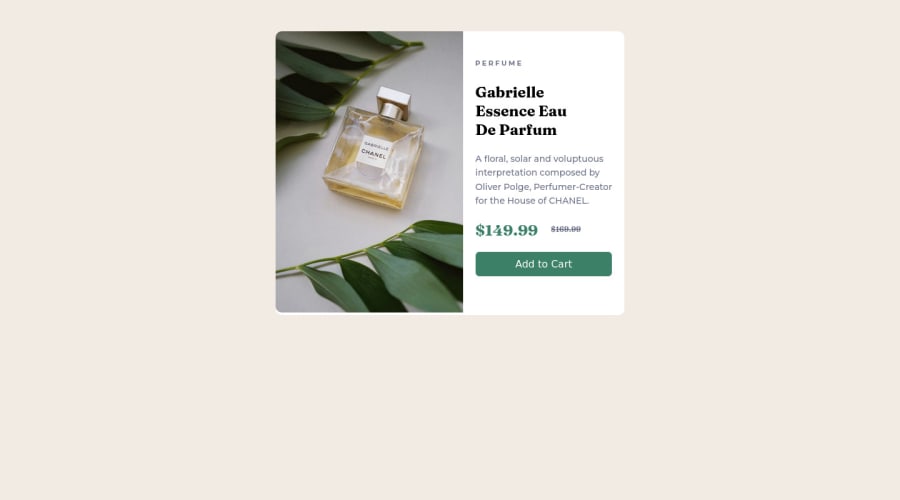
One suggestion is to have the width of the 'details' div the same as the 'image' div. The component will look better this way.
-
Use the <main> tag to enclose the content instead of the 'card' div. It is used to define the main content of a page
-
Kindly avoid using <br> tags. You can have the text content in seperate lines by adjusting the width of the <p> tag.
-
If you are looking to make the component responsive, the Media queries in CSS allow you to create responsive designs that adapt to different screen sizes and devices.
-
Please view "https://www.youtube.com/watch?v=2KL-z9A56SQ&t=62s" for a quick start.
-
Hope this helps. Happy coding!!
Marked as helpful1@Yousef0102Posted over 1 year agothank you so much bro , i will view that video , update the code and then will update the solution , really appreciate your help @vinuman
0 -
Please log in to post a comment
Log in with GitHubJoin our Discord community
Join thousands of Frontend Mentor community members taking the challenges, sharing resources, helping each other, and chatting about all things front-end!
Join our Discord
