

Design comparison
SolutionDesign

Solution retrospective
What are you most proud of, and what would you do differently next time?
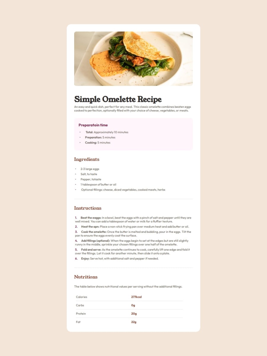
I'm proud of making the web page to look as identical as possible to the Figma design for the larger screen.
What challenges did you encounter, and how did you overcome them?1- styling the un-ordered and ordered lists bullet points and numbers respectively. for the ul list, I set the list-style-type to be none then used pseudo-element li::before to create and style the bullet points themselves. The same concept was applied to the ol items as well.
2- not resolved but making the layout responsive to different screen sizes.
What specific areas of your project would you like help with?- making the the layout responsive using media query
- make the size of the elements to decrease as the screen size decreases so that the content does not go to the next line. For example, each word in the title "Simple Omelette recipe" is in a separate line as the screen size reaches a certain screen size or smaller. I'd like to keep them in the same line in all screen sizes.

Join our Discord community
Join thousands of Frontend Mentor community members taking the challenges, sharing resources, helping each other, and chatting about all things front-end!
Join our Discord