Not Found
Not Found
Not Found
Not Found
Not Found
Not Found
Not Found
Not Found
Not Found
Not Found
Not Found
Not Found
Not Found
Not Found
Not Found
Not Found
Not Found
Not Found
Not Found
Not Found

Submitted

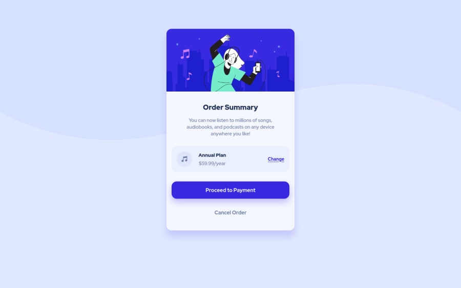
HTML and SCSS Order Summary Component Page

@Temi-pinheiro

Desktop design screenshot for the Order summary component coding challenge

This is a solution for...

  • HTML
  • CSS
1newbie
View challenge

Design comparison


SolutionDesign

Solution retrospective


How did you guys handle the background image? Was it an img tag or did you do it with css?

Community feedback

Vanza Setia 27,795

@vanzasetia

Posted

👋Hi Temitope!

👍 Good job on completing your first challenge!

Regarding to your question: I used background-image on the body element for the background-pattern. In my opinion, it's much easier to control the size and switch the background-pattern between the desktop and mobile version, by using @media query. Also, since it's just a decorative image, so it's the best choice to use background-image.

Feedback:

  • Development code is not a production code. I recommend to delete all commented code, since they were a part of code development code.
  • For any decorative images, you should leave the alt="" and add aria-hidden="true" to make sure all screen readers ignore those images.
  • For the file path, I recommend to use / forwardslash instead of \ backslash. Backslash is commonly use to escape characters.
  • Always wrap text in a meaningful element like paragraph, heading, and etc. It's important for accessibility.
<div class="plan">
   <span>Annual Plan</span>
   $59.99/year
</div>
  • Use rem or sometimes em instead of px. Using px won't allow the user to control the size of your page based on their needs.
  • For the media query unit, I recommend to use em. It's simply because, **the only unit that performed consistently across all four browsers is em. ** You can check this blog post about "PX, EM or REM Media Queries?" to learn more.
  • On my mobile view portrait mode (360px * 640px), the content inside the card is overflowing. The reason for that is because, you set the height of the card using vh. I would recommend to remove the width and the height property and use max-width and max-height instead.

That's it! Hopefully this is helpful!

Marked as helpful

1

@Temi-pinheiro

Posted

@vanzasetia Thank you so much Vanza, this was really helpful, I will try to incorporate all your feedback and it will reflect in my future project. I will also update the code base of this solution.

0

Please log in to post a comment

Log in with GitHub
Discord logo

Join our Discord community

Join thousands of Frontend Mentor community members taking the challenges, sharing resources, helping each other, and chatting about all things front-end!

Join our Discord