Design comparison
SolutionDesign
Solution retrospective
comments pls...I need Comments.
Community feedback
- Account deleted
Hi,
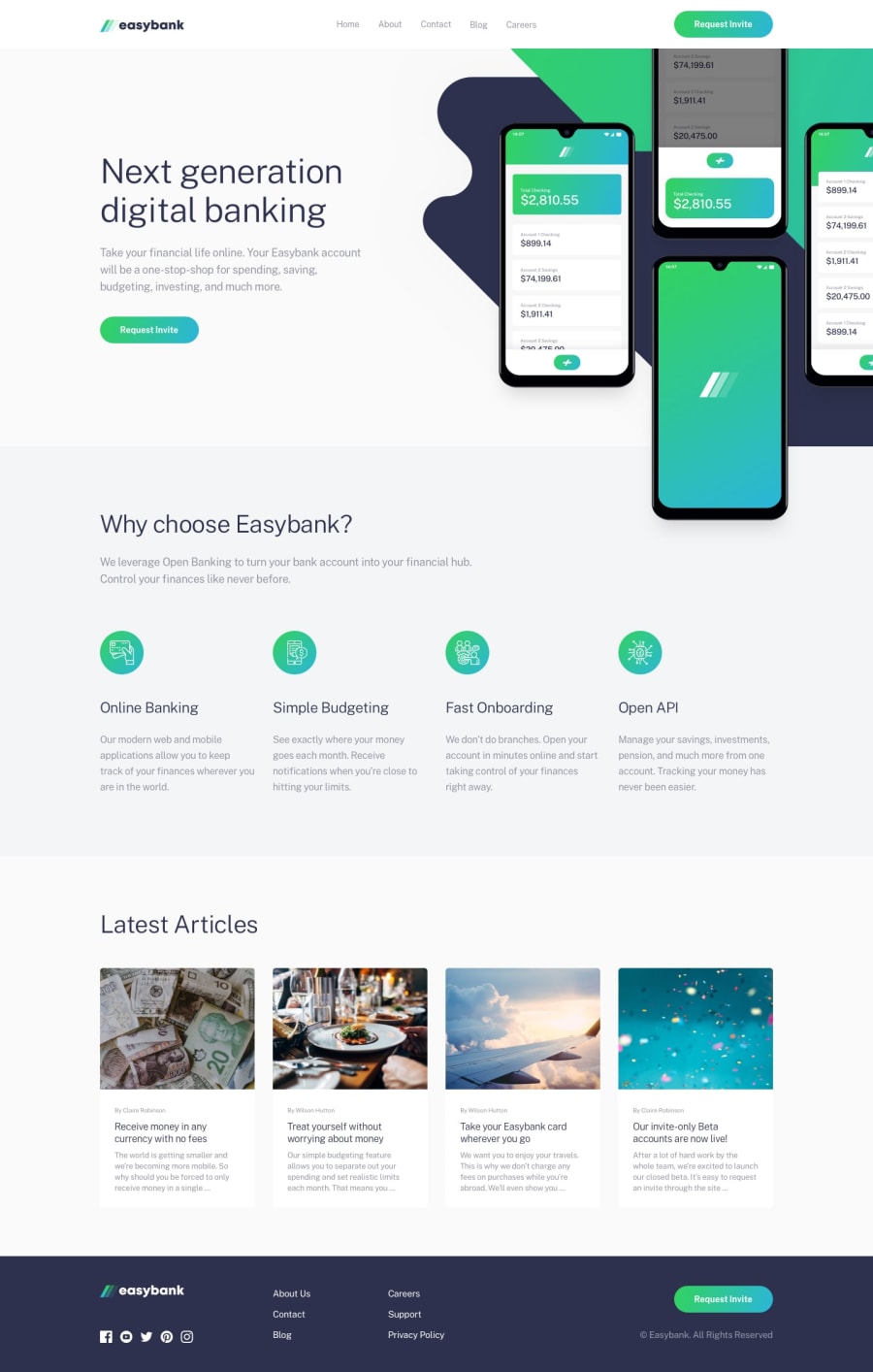
The desktop view looks good.
-
The container of the
hero imagesshould be givenoverflow : hiddenbecause they are protruding and giving the whole page a horizontal scroll. -
Going into mobile and activating the mobile menu and then returning to mobile while it's still active... the mobile menu gets carried into desktop view and is not dismissed.
-
I don't know why you made two separate navigations, whereas one would have done the job.
Keep coding👍.
Marked as helpful1@ahngePosted about 3 years ago@thulanigamtee Thanks for your suggestions and I will keep coding. :)
0 -
Please log in to post a comment
Log in with GitHubJoin our Discord community
Join thousands of Frontend Mentor community members taking the challenges, sharing resources, helping each other, and chatting about all things front-end!
Join our Discord
