Submitted over 3 years ago
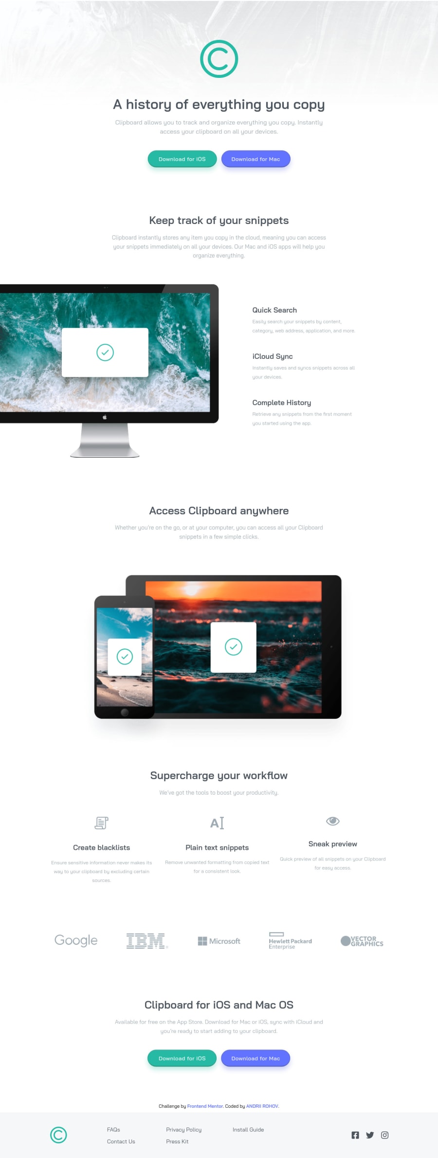
HTML & SCSS in VS code, media queries for responsive mobile version
@Andrii-Rohov
Design comparison
SolutionDesign
Solution retrospective
Hello everyone, this challenge was easy, but in the same time a lot of fun)) Anyway, if you have any feedback about my solution please leave a comment.
Community feedback
- @palgrammingPosted over 3 years ago
It would be better to let your 5 company images stay they same size but then wrap to a new row when their was not space in the browser to fit them on one line cause when in the mobile view when they all become in one column the images expand in size and become blurry as they are stretched
Marked as helpful0@Andrii-RohovPosted over 3 years ago@palgramming oh yeah, i think i just gonna add max-width: to them. It should help with blurring, and easy to fix. Thanks for your reply)
1
Please log in to post a comment
Log in with GitHubJoin our Discord community
Join thousands of Frontend Mentor community members taking the challenges, sharing resources, helping each other, and chatting about all things front-end!
Join our Discord
