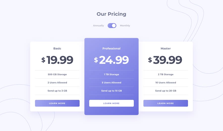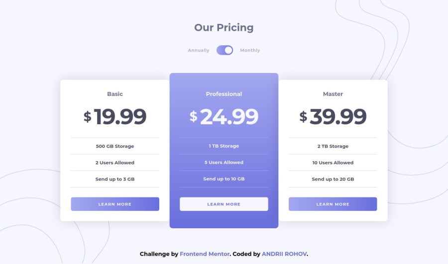
Design comparison
Solution retrospective
Hello everyone, this challenge was easy, but in the same time a lot of fun)) I guess i get more confident with my layout skills, and get used to scss and newbie javascript. Anyway, if you have any feedback about my solution please leave a comment.
Community feedback
- @ApplePieGiraffePosted over 3 years ago
Hi, Андрій Рогов! 👋
Nice job on this challenge! 👏 I like the animation you added to the prices when the monthly/yearly toggle-switch is clicked! 😀 It's good to hear that you had fun completing this challenge, as well! 🙂
One or two small things I'd like to suggest are,
- Adding a max-width to the pricing cards in the mobile layout (so that they aren't too wide when the layout first changes from desktop to mobile).
- Making the toggle-switch keyboard-accessible so that it can be reached and used by users using their keyboards.
Keep coding (and happy coding, too)! 😁
Marked as helpful0@Andrii-RohovPosted over 3 years ago@ApplePieGiraffe about max-width, it's a nice idea thanks) and about keyboard-accessible, i already added events onto arrow keys, and thats a maximum what i can do now) but thanks for replying
1@ApplePieGiraffePosted over 3 years ago@Andrii-Rohov
Oh, okay! 😅 Glad to help! 👍
0
Please log in to post a comment
Log in with GitHubJoin our Discord community
Join thousands of Frontend Mentor community members taking the challenges, sharing resources, helping each other, and chatting about all things front-end!
Join our Discord