Design comparison
Solution retrospective
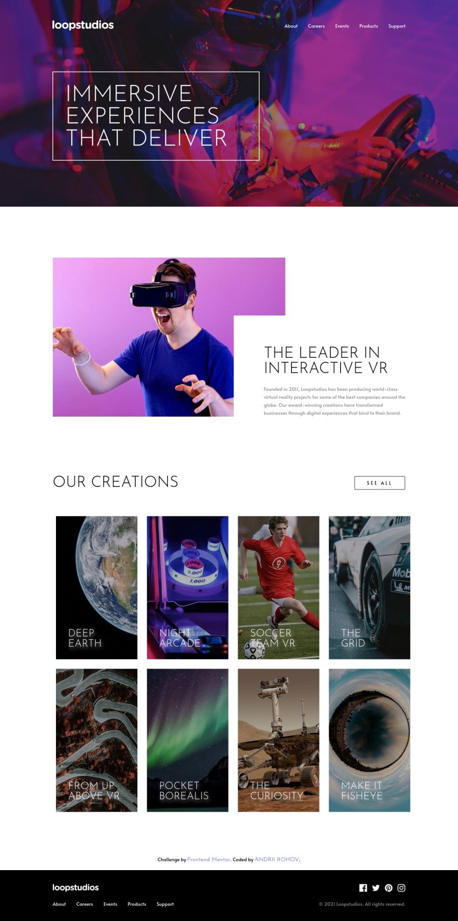
Hello. This project was not that hard. I had a lot of fun building this page, hope you would check it and point out the errors.I think i get more confident with my layout skills, and get used to scss, but my main weak point is JS =| ... Anyway, if you have any feedback about my solution please leave a comment.
Community feedback
- @ChamuMutezvaPosted over 3 years ago
- the desktop design looks great but yes you still have to work on the responsive side of the site.
- personally i prefer to use
class
instead of id's as they are reusable - the nav items i would suggest to have them in an unordered list to help with accessibilty
Happy coding
Marked as helpful0 - @gsterczewskiPosted over 3 years ago
Hello Andrii-Rohov 👋, my name is Grzegorz.
Your solution looks super awesome on desktop, and it's alomost pixel-perfect with the design.
One thing to check it's the responsiveness on screen width < 768px, because right now your layout does not fit on the screen.
I'm sure it is just a small overlook.
Overall, I am impressed with your work and animations that you add.
Keep up the good work! 💪
See you on the coding trail 😉
Cheers!
Marked as helpful0@Andrii-RohovPosted over 3 years ago@GSterczewski yeah.... in design files there was a mobile layout image, and it was 750px when usually it 350px, and i decided to do it only for width > 750...i guess i'm not done with this challenge yet)) thanks))
0
Please log in to post a comment
Log in with GitHubJoin our Discord community
Join thousands of Frontend Mentor community members taking the challenges, sharing resources, helping each other, and chatting about all things front-end!
Join our Discord