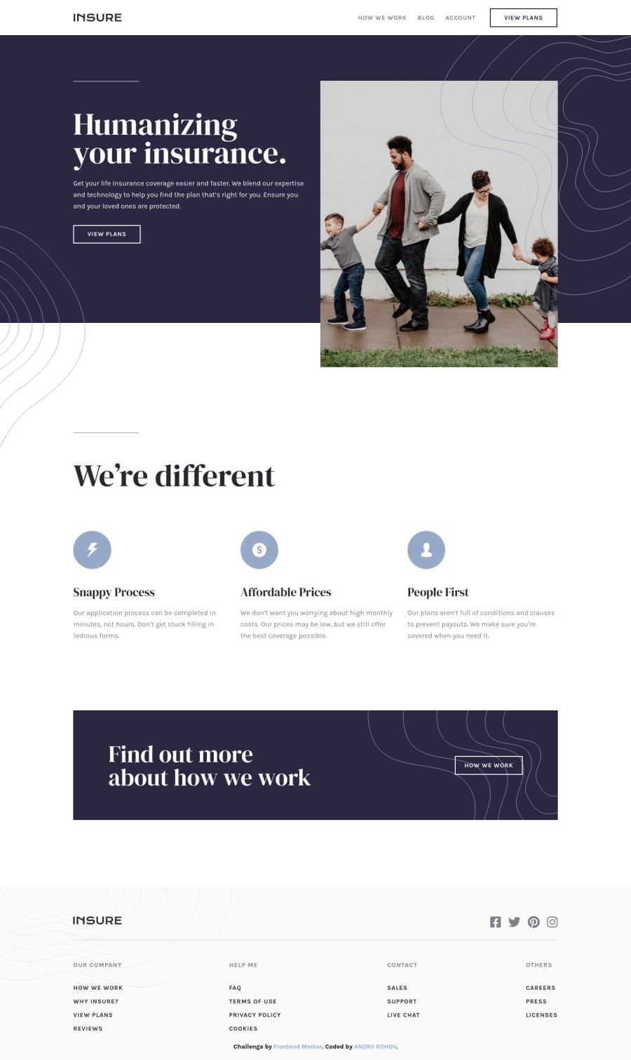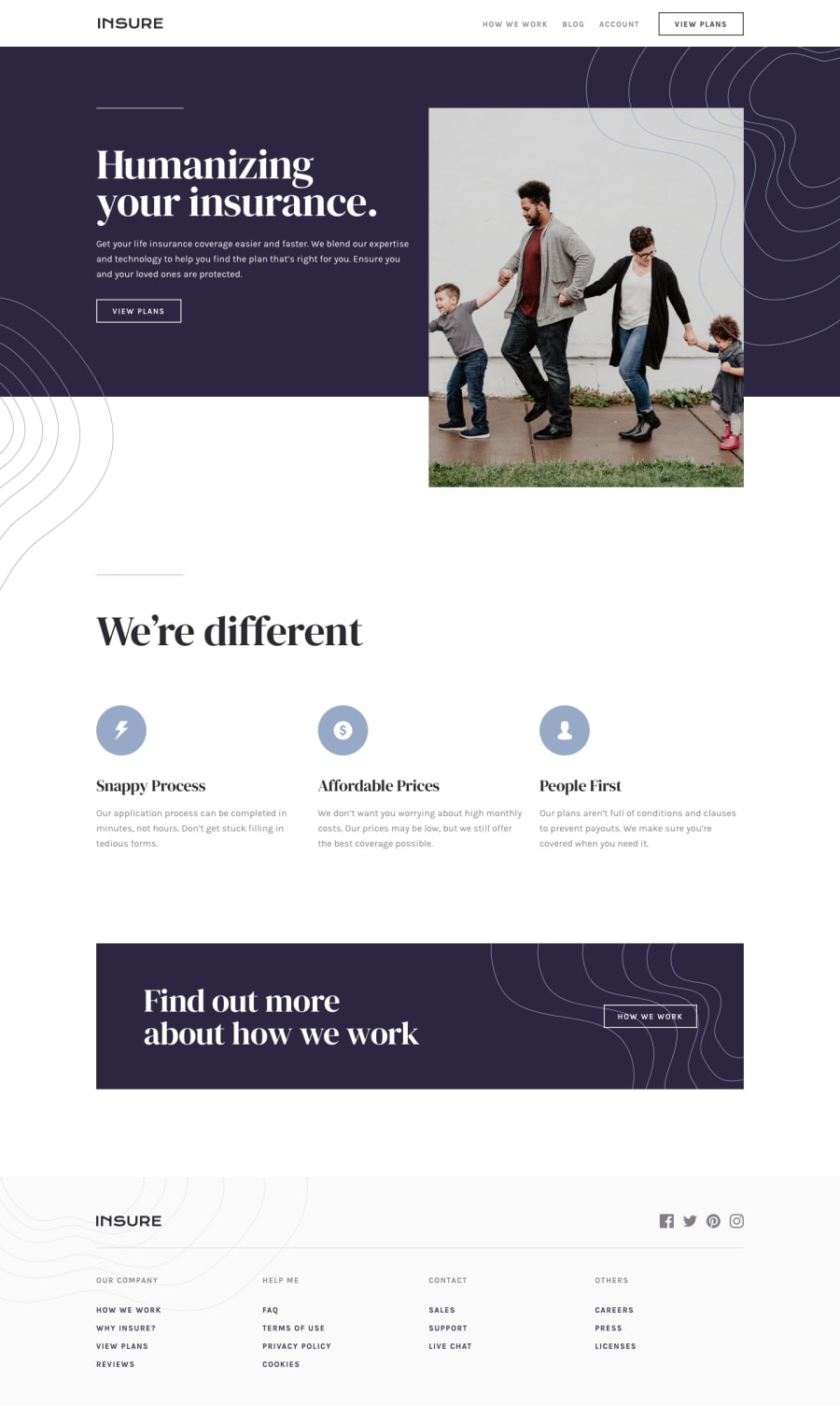
Design comparison
Solution retrospective
Hello. In this project i tried to set all font-sizes and other stuff to viewport width(vw) unit, hope you would check it and point out the errors.
Community feedback
- @afrusselPosted over 3 years ago
Overall good work. Try to use HTML5 tags like main, section, article is a better practice. For font-size use rem instead of px/%/vw
Marked as helpful1 - @ixtkPosted over 3 years ago
I wouldn't recommend using
wvunit for font-sizes. The problem is that if user changes their font size in settings, your website doesn't adapt. It also doesn't change font size if user zooms in/out. So it is only responsive to width of the window, which is not ideal. On some widths, font looks way too big/small (743px, 764px)Other than that, consider adding
mainelement and check the reportMarked as helpful0 - @ChamuMutezvaPosted over 3 years ago
- for font size use rems
- use classes mainly instead of divs, avoid over nesting your styles. Where ever possible nest only pseudos. Heavily nested css is difficult to maintain and debug
#header #header-wrapper #header-navbar-wrapper ul li:last-of-type a:hover, #header #header-wrapper #header-navbar-wrapper ul li:last-of-type a:focus { text-shadow: 0px 2px 3px #a252f3; background-color: #2b272f; color: #fafafa; -webkit-box-shadow: 0px 5px 15px 3px rgba(162, 82, 243, 0.25); box-shadow: 0px 5px 15px 3px rgba(162, 82, 243, 0.25); }- the hamburger image is being used as an interactive element , it won't be beneficial to screen readers as it wont be accessible as a button but announced as
menu-icon. You can make the icon a child of a button.
1
Please log in to post a comment
Log in with GitHubJoin our Discord community
Join thousands of Frontend Mentor community members taking the challenges, sharing resources, helping each other, and chatting about all things front-end!
Join our Discord
