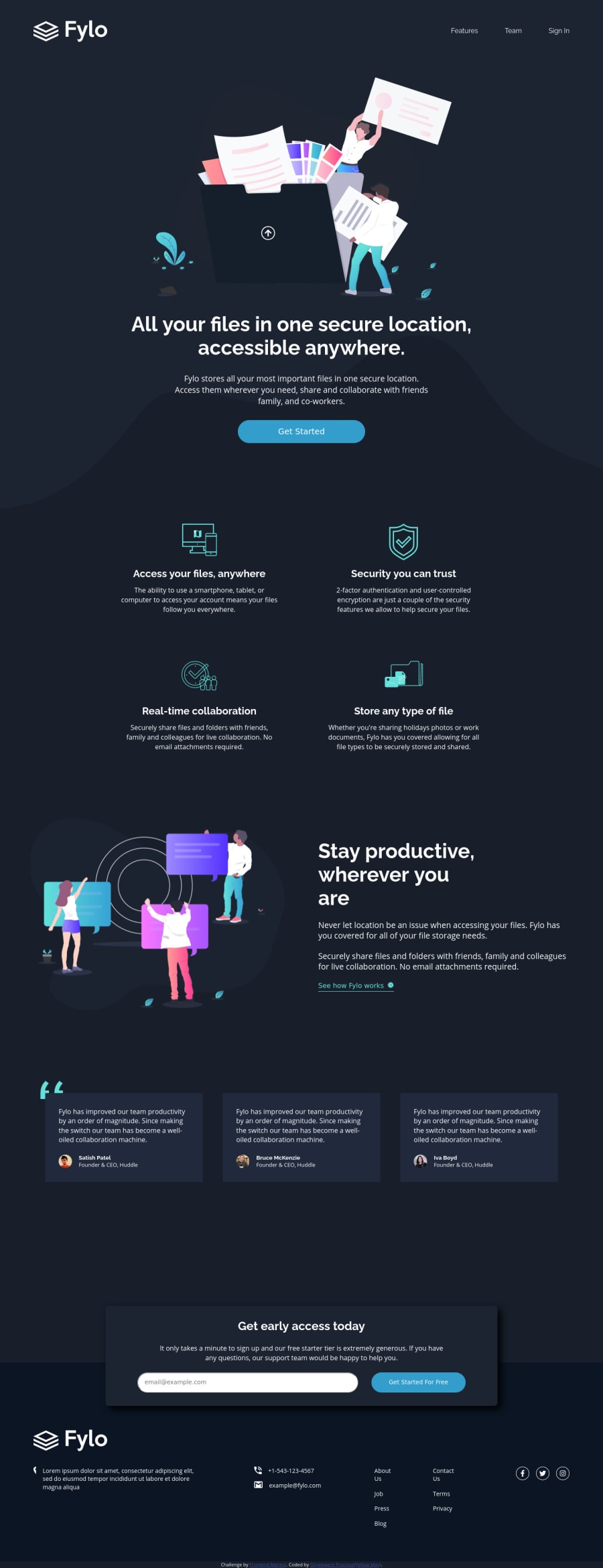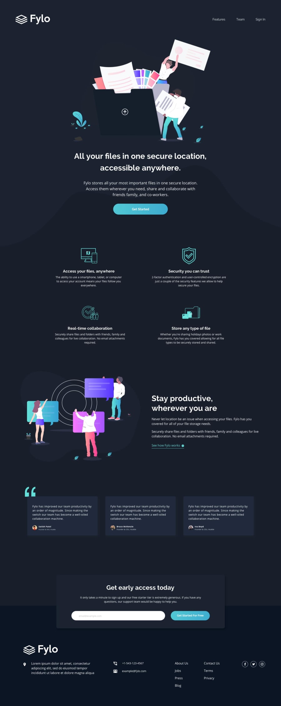
Design comparison
Solution retrospective
Anything is fine, Thank you.
Community feedback
- @Antoine-FloPosted over 4 years ago
Hi Onyekwere Precious 👋
Good job it looks really nice 👍 but why did you use a min-width on your body 🤔 try to remove it and your layout will response nicely when you reduce the screen size.
Apart from that, it looks really nice, keep coding 😀
0@Yellow-MayPosted over 4 years ago@Antoine-Flo i chose min-width because the exercise was for only width: 1440px and 375px i didn't want any odd looking adjustments when the screen size reduces.
I felt it safer to use than adding more media queries than necessary
0@Antoine-FloPosted over 4 years ago@Yellow-May I don't think it says "only" 1440px and 375px.
It just means that the screenshots where made at this screen size. The desktop screenshot was 1440px and the mobile was 375px, it's just an indication.
0
Please log in to post a comment
Log in with GitHubJoin our Discord community
Join thousands of Frontend Mentor community members taking the challenges, sharing resources, helping each other, and chatting about all things front-end!
Join our Discord
