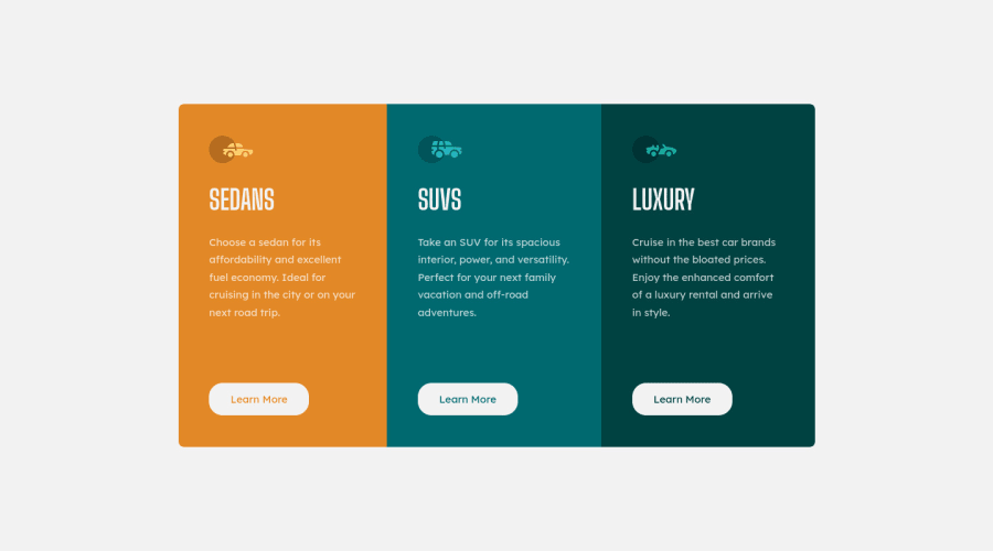
Design comparison
Solution retrospective
What is best approach to dealing with how a website looks in mobile landscape views? Should it be standard practice to preview page in mobile landscape view (as you can with browser tools), and make sure everything looks right?
The design files for this challenged did not have a landscape view. Is it common to be given landscape views on real world projects as a guide?
For this project, the landscape views I previewed seemed to cut off the buttons in a way that did not look right. I ended up adding a media query for max-height that adjust things for landscape view.
Community feedback
- @adram3l3chPosted over 3 years ago
main { height: 100vh; display: flex; align-items: center; }
to center the cards
Marked as helpful0@ACdev27Posted over 3 years ago@adram3l3ch Thank you for your suggestions. I used your advice, and can see that it is a good way to vertically center the cards. That inspired me to better match the provided design, so I also adjusted my card size and padding in the card also.
1
Please log in to post a comment
Log in with GitHubJoin our Discord community
Join thousands of Frontend Mentor community members taking the challenges, sharing resources, helping each other, and chatting about all things front-end!
Join our Discord
