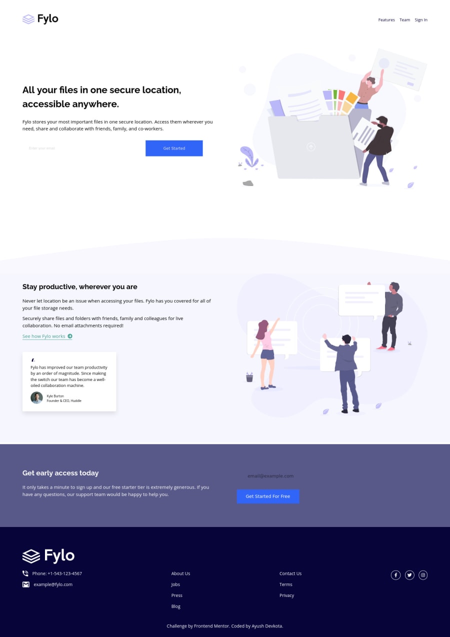
Design comparison
Solution retrospective
Feedbacks are appreciated. Edit: For some weird reason the screenshot has the email sign-up near the footer completely wrong than what it is in the live site even though I've already generated a new screenshot.
Community feedback
- P@dwhensonPosted almost 4 years ago
Hey @AyushDevkota very nice job here! 🙌 The page looks great and responds well too. Here's some points you might like to consider:
-
At small screen sizes the images seem to be overflowing and causing some horizontal scrolling. I think removing the
width:autowould solve this or perhaps setting amax-width: 100%as a default on all images would be a good option (I do this in my reset) -
You can see you have couple of accessibility issues flagged. This is because an
inputmust always have alabelassociated with it. Here's a nice article that gives a good explanation of why this is: https://css-tricks.com/html-inputs-and-labels-a-love-story/ (you can always hide the label using CSS if you don't want people to see it) -
Lastly, I would suggest putting some upper constraints of the main part of the page, so that at really large screen sizes the content retains a nice layout. I have been using the following code on the body of all my projects and found it to work well for this:
.center-content {
  display: grid;
  grid-template-rows: min-content;
  grid-template-columns: minmax(1rem, 1fr) minmax(0, 1440px) minmax(1rem, 1fr);
}
.center-content > * {
  grid-column: 2;
}
The 1440px is the max-width you want the main content to be, and the 1rem values is the smallest spacing you want either side of the main content on small screens (I sometimes put this to 0 and use a container to add padding to each section). The second part positions all direct children of the body in this nicely sized middle column.
You can also break sections out of this to span all three columns if you need to.
Hope this helps and just let me know if anything is poorly explained and I'll try and clarify things! Great work once again!! Keep it up 👍
Cheers 👋
1@AyushDevkotaPosted almost 4 years ago@dwhenson sorry for the late reply. I have a couple of issues:
- How small screen sizes are we talking about? I usually just check responsiveness by making the chrome as small as possible and there was no horizontal scrolling and after you said that, I even checked in my phone and there is no scrolling? What would you suggest would be the best way to check responsiveness?
- So I read the article and it says if there is an input followed by a button, there is no need for a label. Do I just put an empty label before the input with the 'for' attribute which matches the id of the input?
- I will try your grid setup starting from my next project to see the differences. I also only have 1366 pixels wide screen so can't really see how it pans out for a 1440 px screen. Very happy for the thorough and detail feedback. I will try to use all this knowledge in the future. Thank you.
1P@dwhensonPosted almost 4 years ago@AyushDevkota glad you found something useful. Here's some clarifications:
-
I check at 375px wide as this is in the design specs. I use Firefox developer edition, and switch on the responsive view. This shows horizontal scrollbars and also flags problem elements with an
overflowlabel. I'll try and attach an image. -
I didn't get that from the article - a
buttondoesn't need a label if it has some text (e.g. submit) as this acts as the label. If it empty or just an image you should add one.
The label should not be blank but rather tell people what action is needed (e.g. Add email). The content would probably be similar to what you would put in the placeholder. Again, you can then hide the label with CSS if you don't want people to see it.
- Good luck with tat and just let me know if there are any issues. Again the responsive view on Firefox or Chrome also lets you zoom in and out so even on a smaller screen you can see how it would look on very large screens.
Cheers 👋
0P@dwhensonPosted almost 4 years ago@dwhenson Sorry seems I can't insert an image here. So here's a link to image: https://www.dropbox.com/s/1r9e3tav56tn5o5/Screenshot%202021-06-04%20at%2011.13.17.png?dl=0
0 -
- @Muhammad-samirPosted almost 4 years ago
Every thing looks good you just have to add img { max-width:100%} and you will see the magic
0
Please log in to post a comment
Log in with GitHubJoin our Discord community
Join thousands of Frontend Mentor community members taking the challenges, sharing resources, helping each other, and chatting about all things front-end!
Join our Discord
