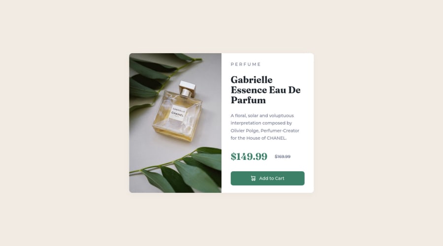
Design comparison
Solution retrospective
Hey everyone! I hope you're doing okay. This was my first project. If you have time, any feedback is appreciated : )
Community feedback
- @VCaramesPosted almost 2 years ago
Hey there! 👋 Here are some suggestions to help improve your code:
- To not only improve your HTML code but to also identify the main content of you page, you will want to wrap your entire component inside the
mainelement.
More Info:📚
- The
alt tagdescription for the image needs to be improved upon. You want to describe what the image is; they need to be readable. Assume you’re describing the image to someone.
More Info:📚
https://www.w3.org/WAI/tutorials/images/
- Currently, the old price (169.99) 🏷 is not being properly announced to screen readers. To fix this, inside the
delelement you will want to add aspanelement with ansr-only classthat will state something like “The previous price was…” and use CSS to make it only visible to screen readers.
If you have any questions or need further clarification, feel free to reach out to me.
Happy Coding!🎄🎁
Marked as helpful1@hesam-fattahiPosted almost 2 years ago@vcarames Hey!👋 Thank you so much for your comment. I've updated the code changing
articletomainand updating thealttext for the image. As for the old price, is it better to usedelwith an element usingsr-onlyor usingpwithtext-decorationin CSS?Again, thank you so much for your help. 🙏🙏
0@VCaramesPosted almost 2 years ago@hesamf01
Glad I could help!
For semantic reasons and since it will automatically strike a line through the text, it is better to use the
del.Keep it up!
Marked as helpful1 - To not only improve your HTML code but to also identify the main content of you page, you will want to wrap your entire component inside the
Please log in to post a comment
Log in with GitHubJoin our Discord community
Join thousands of Frontend Mentor community members taking the challenges, sharing resources, helping each other, and chatting about all things front-end!
Join our Discord
