Design comparison
Solution retrospective
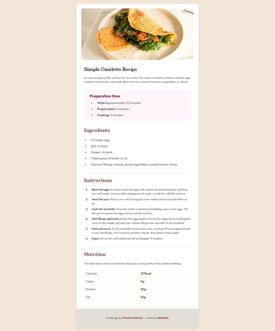
I'm most proud of how I was able to implement a fully responsive design that adheres to accessibility standards. By using semantic HTML and CSS best practices, I created a clean and intuitive user interface. The use of flexbox and CSS Grid allowed me to achieve a flexible layout that looks great on both mobile and desktop screens.
Additionally, I'm proud of the project structure and how I managed my workflow using a mobile-first approach. This helped me prioritize essential design elements for smaller screens and progressively enhance the experience for larger displays.
What Would I'll Do Differently Next Time?
While I'm satisfied with the outcome, there are a few things I would do differently next time:
1. More Testing Across Browsers: I would allocate more time for cross-browser testing to ensure consistency across different environments.
2. Explore More CSS Techniques: I would like to experiment with advanced CSS techniques such as animations and transitions to make the page more dynamic and engaging.
3. JavaScript Enhancements: Adding some JavaScript functionality to improve interactivity, such as form validation or user feedback mechanisms, would enhance the user experience.
4. Focus on Performance Optimization: I would spend more time optimizing images and other assets to ensure faster loading times and a smoother user experience.
5. Seek More Feedback Early: Gathering more feedback from peers or users early in the development process could help identify potential improvements and guide my design decisions.
What specific areas of your project would you like help with?I would appreciate help with:
1. Accessibility Improvements: Guidance on improving accessibility features for a more inclusive user experience.
2. Advanced CSS Techniques: Suggestions for using advanced CSS techniques to enhance visual appeal.
3. Code Review: Feedback on code structure and best practices to improve maintainability.
4. Performance Optimization: Tips on optimizing images and CSS for faster load times.
5. JavaScript Enhancements: Advice on adding interactive elements to enhance user engagement.
Community feedback
- P@Franciscoj91Posted 8 months ago
Good job with the use of semantic tags.
I would take the h1 out of the header and place it in the section with the intro class.
I liked your approach to design.
Marked as helpful0 - @DebabrataBanikPosted 8 months ago
Well done! Your solution looks great. You might want to add some padding to the body to prevent content from sticking to the edges on larger viewports.
Marked as helpful0
Please log in to post a comment
Log in with GitHubJoin our Discord community
Join thousands of Frontend Mentor community members taking the challenges, sharing resources, helping each other, and chatting about all things front-end!
Join our Discord
