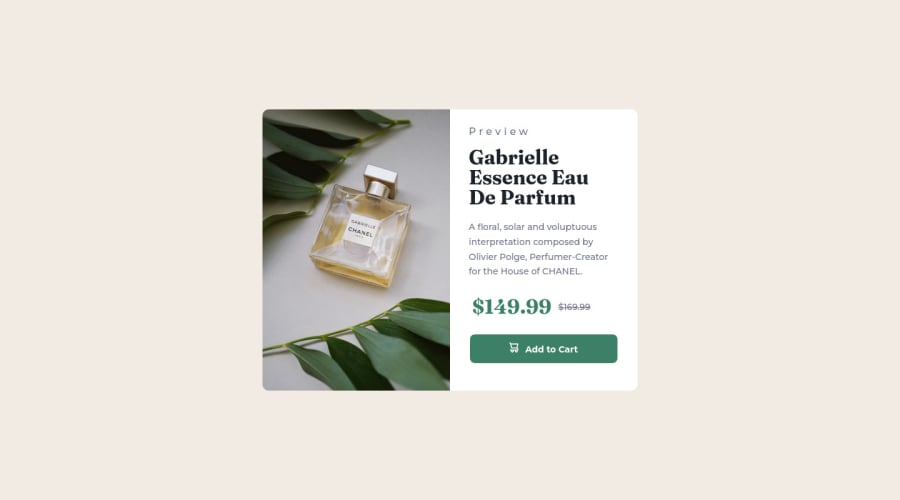
Design comparison
Community feedback
- @MahdiSohailyPosted over 2 years ago
I also reviewed your code and find out some warnings in it. first, your approach to adding images to the page is wrong. you can search about the HTML picture element and find out the problem. second, the CSS structure is not good, you can read about CSS code best practices and find out the solution. (avoid long nesting classes, fixed sizes ...).
all the best
1@mohamedKhaled89Posted over 2 years ago@MahdiSohaily thanks man
- I will try to take your advice into consideration
1 - @MahdiSohailyPosted over 2 years ago
well done dear Mohamed Khaled, but pay attention to the challenge's font style, transformation, and image overlay. all the best.
1@mohamedKhaled89Posted over 2 years ago@MahdiSohaily thanks Mahdi Rezaei
- but I have a problem here
- the solution pic is wrong
- the pic doesn't look like the preview site
- what should I do?
1@MahdiSohailyPosted over 2 years ago@mohamedKhaled89 if you optimized your design and you are pretty sure about your changes you can click on generate new screenshot button on the bottom of the screenshot comparing page but be careful about that because you can try it just five times in a month
1
Please log in to post a comment
Log in with GitHubJoin our Discord community
Join thousands of Frontend Mentor community members taking the challenges, sharing resources, helping each other, and chatting about all things front-end!
Join our Discord
