Design comparison
Solution retrospective
Your feedback THANKS
Community feedback
- @IshmaelsealeyPosted almost 3 years ago
<div class="item3">
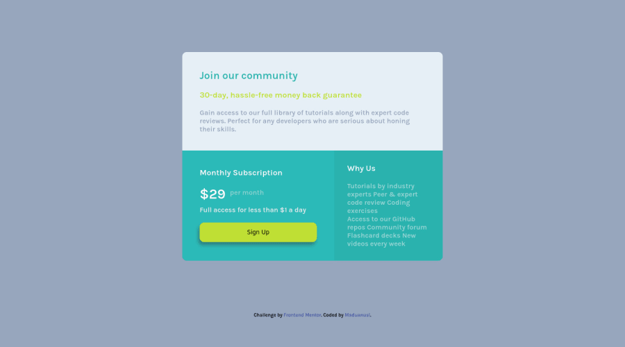
        <h3>Why Us</h3>
        <p class="why-us">
          Tutorials by industry experts
          Peer & expert code review
          Coding exercises
          <p>Access to our GitHub repos
          Community forum
          Flashcard decks
          New videos every week</p>
        </p>
      </div>
You could do this section better by only using 1 big paragraph tag, (excluding the heading tag) with line break tags
<br/>where you wanted the line to end<div class="item3"> <h3>Why Us</h3> <p class="why-us"> Tutorials by industry experts<br/> Peer & expert code review<br/> Coding exercises<br/> Access to our GitHub repos<br/> Community forum<br/> Flashcard decks<br/> New videos every week<br/> </p> </div>My second point is that the Sign Up button doesn't do anything when I hover over it. If you don't know how to do that, this should help you get started.
There are other minor things that stray from the original design but I don't see them as major problems.
Good Job!
0@therealmaduanusiPosted almost 3 years ago@Ishmaelsealey honestly I forgot to implement the "break line" tag in it 😔 I'll fix that later also why I didn't add an hover effect was because the design didn't say so(or maybe I skipped it 🤷🏻♂️)
1
Please log in to post a comment
Log in with GitHubJoin our Discord community
Join thousands of Frontend Mentor community members taking the challenges, sharing resources, helping each other, and chatting about all things front-end!
Join our Discord
