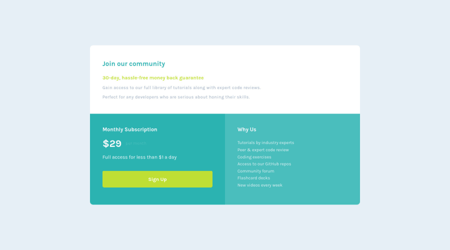
Design comparison
SolutionDesign
Solution retrospective
I've made many errors, neither able to handle the the width of the elements in desktop resolution nor in mobile resolution. Please help me out!
Community feedback
- @shivjoshi1996Posted over 3 years ago
Hey Akshay,
Great job!
If you are talking about controlling the width of the entire card, you can simply add a "max-width" on the .container class for each of the breakpoints. E.g. 700px for the desktop container class will not allow the card to go past the width of 700px, but will allow it go stretch up to that point.
Thanks!
0
Please log in to post a comment
Log in with GitHubJoin our Discord community
Join thousands of Frontend Mentor community members taking the challenges, sharing resources, helping each other, and chatting about all things front-end!
Join our Discord
