Design comparison
SolutionDesign
Solution retrospective
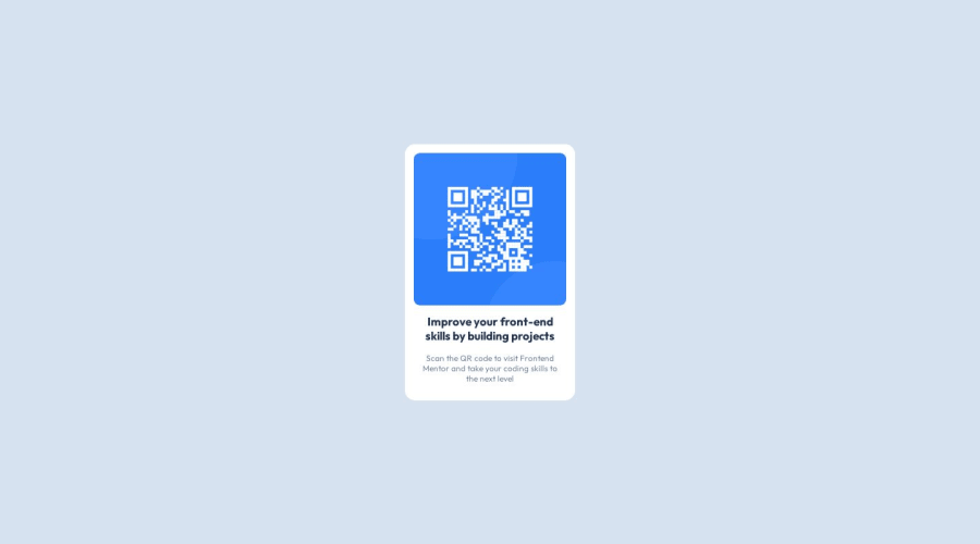
Hello devs, this project was very fun and simple to make, but as a beginner, I suppose it has some errors.
Community feedback
- @pRicard0Posted over 1 year ago
Some HTML tips
- I think your HTML needs to be more semantic. You need to use main instead of the div and h1 instead of span.
Some CSS tips.
- For styling a webpage, we use relative units like em and rem instead of absolute measurements like px (pixels). This is because nowadays, screen sizes come in different sizes and shapes. If we use px , the element's size remains constant regardless of the size of the screen. Using frameworks, like TailwindCSS, you will only use rem instead of pixel.
Marked as helpful1@BrunnoHibbelnPosted over 1 year ago@pRicard0 I didn't know about these tips, I'll look into it, thank you very much.
1
Please log in to post a comment
Log in with GitHubJoin our Discord community
Join thousands of Frontend Mentor community members taking the challenges, sharing resources, helping each other, and chatting about all things front-end!
Join our Discord
