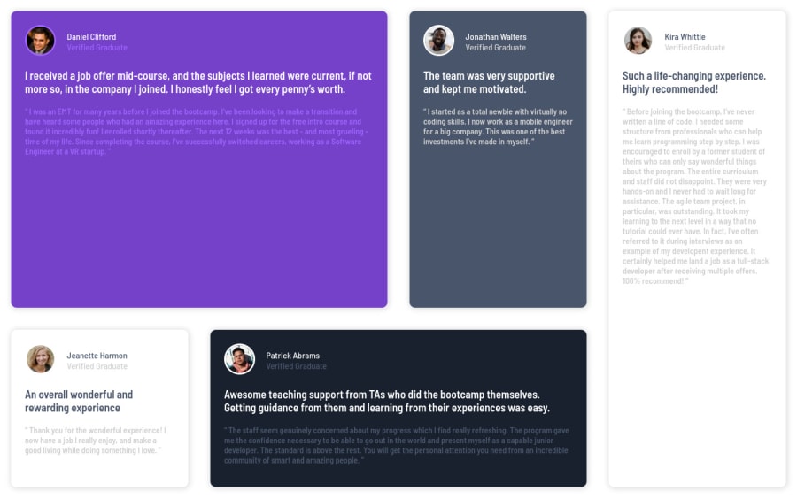
Design comparison
Community feedback
- @correlucasPosted about 2 years ago
👾Hello Franco Carrillo, congratulations for your new solution!
1.You need to fix the
container sizethat is a bit off, this challenge uses the standard container size that ismax-width: 1110px.2.Something you can do is to improve your html markup using meaningful tags and replacing the divs. In this case, for example the main block/div that takes all the content can be wrapped with
<main>or section, if you think about = the cards you can replace the<div>that’s wrapping each card with<article>you can wrap the paragraph with the quote with the tag<blockquote>this way you'll wrap each block of element with the best tag in this situation. Note that<div>is only a block element without meaning, prefer to use it for small blocks of content inside bigger blocks wrapped with some better markup.Here's a complete guide for HTML semantic TAGS: https://www.w3schools.com/TAgs/default.asp
✌️ I hope this helps you and happy coding!
0
Please log in to post a comment
Log in with GitHubJoin our Discord community
Join thousands of Frontend Mentor community members taking the challenges, sharing resources, helping each other, and chatting about all things front-end!
Join our Discord
