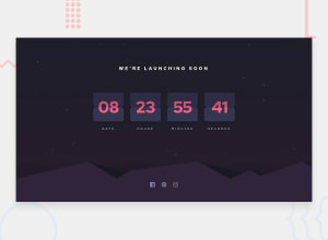
Design comparison
SolutionDesign
Solution retrospective
Need More improvements on the card. Your feedback is highly appreciated
Community feedback
- @abhik-bPosted almost 4 years ago
Hi Harold,
You have done a good job on this challenge and I agree with you , your card needs improvement.
However for hills background on mobile devices you can do these:
- try to adjust
background-positionin media queries for mobile devices - how I am going to do is
background-position: -850px bottom;
Also replace
href="#"withhref="/"for all a tags to fix accessibility issuesOther than those , good job 👌 Keep it up 💯
0@harika09Posted almost 4 years ago@abhik-b thanks for the feedback. i will fix it asap. thanks again
1 - try to adjust
Please log in to post a comment
Log in with GitHubJoin our Discord community
Join thousands of Frontend Mentor community members taking the challenges, sharing resources, helping each other, and chatting about all things front-end!
Join our Discord
