Design comparison
Solution retrospective
Any feedback is welcome, especially on flexbox and if you can bring me help with the positioning of some parts.
Community feedback
- @Alberto-SCPosted about 4 years ago
good work
1 - @rfilenkoPosted about 4 years ago
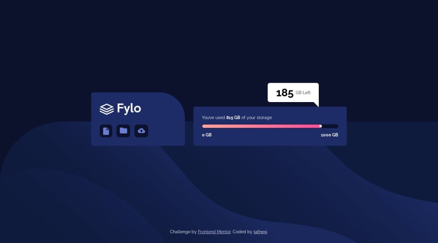
Hey, a quick tip - place .triangle (probably section tag is not suitable here) inside .hero__item--02 - this way it will be always constrained inside that parent div while on different viewports.
Cheers, Roman
1@tafnesjPosted about 4 years agoThank you! It's great advice, I'll apply it. I appreciate your feedback too much.
8 - @ApplePieGiraffePosted about 4 years ago
Nice work!
The little white popup that says "185 GB Left," however, seems a little bit all over the place when I resize my screen.
My suggestion would be to use absolute positioning to position that element relative to the dark blue box on the left. Or perhaps you could use the transform property to place it where you want.
Otherwise, your solution looks very neat!
1@tafnesjPosted about 4 years agoThank you for the feedback! I will consider it to improve it.
6 - @rishipc-maxPosted about 4 years ago
It is really cool👍. Good job
1
Please log in to post a comment
Log in with GitHubJoin our Discord community
Join thousands of Frontend Mentor community members taking the challenges, sharing resources, helping each other, and chatting about all things front-end!
Join our Discord
