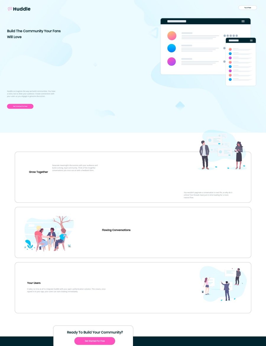
Design comparison
SolutionDesign
Solution retrospective
All feedback is welcome!
Community feedback
- @TishGPosted almost 5 years ago
Hi Mario,
I recommend taking a look at your body width and element heights and widths. A lot of elements are out of place both on mobile and desktop.
2 - @mattstuddertPosted almost 5 years ago
Hey Mario, as @TishG mentioned, it would be a good idea to review your styles. In particular, I'd recommend avoiding setting the
heightproperty as much as possible. It can lead to odd layout issues, especially as you resize the screen. Instead, let the inner content of the element dictate the height of the element. You can then usepaddingwithin it to help with the spacing.Let me know if you have any questions.
1
Please log in to post a comment
Log in with GitHubJoin our Discord community
Join thousands of Frontend Mentor community members taking the challenges, sharing resources, helping each other, and chatting about all things front-end!
Join our Discord
