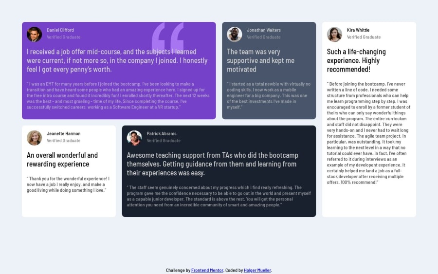
Design comparison
SolutionDesign
Solution retrospective
What are you most proud of, and what would you do differently next time?
I'm proud that I figured out grid enough to get the desktop layout. I thought it was never going to happen.
What challenges did you encounter, and how did you overcome them?With grid, figuring how to get the one card to span two rows while the rest only span one row. Also, figuring out which element should have an H1element, since these items would most likely appear on a page that has an H1.
What specific areas of your project would you like help with?Any constructive criticism or anything I missed? I'm all ears.
Join our Discord community
Join thousands of Frontend Mentor community members taking the challenges, sharing resources, helping each other, and chatting about all things front-end!
Join our Discord
